
Most restaurants lose revenue through their menus without realizing it.
You might have a menu you're proud of. The paper stock feels premium. The layout looks clean. The branding matches the room. But if guests skip your best-margin items, hesitate at the wrong moment, or order third-party because your direct menu feels unclear, that menu isn't helping your business. It's performing for your ego.
That's what I call a Vanity Restaurant Menu. It looks polished, but it doesn't sell with discipline. It doesn't steer choices, protect margins, or reduce friction for staff and guests.
A profitable menu works like a quiet server. It guides attention, simplifies decisions, prompts add-ons, and keeps pricing clear enough that guests trust what they're ordering.
Table of Contents
- Is Your Menu Designed for Looks or for Profit
- How a Vanity Menu Quietly Hurts Your Bottom Line
- Optimize Your Menu Layout and Pricing Psychology
- Engineer Profit with Smart Bundles and Upsells
- How Digital QR Menus Turn Insights into Revenue
- Your 3-Step Action Plan for a More Profitable Menu
Is Your Menu Designed for Looks or for Profit
A menu can be attractive and still be weak.
I've seen owners spend heavily on design, then bury their strongest items in dead zones, overload guests with choices, and price everything in a way that invites comparison instead of commitment. The result is simple. Popular items move, but profit doesn't improve enough.
A vanity restaurant menu is built around taste, not performance. Usually the owner's taste. Sometimes the designer's. Occasionally the chef's. Rarely the guest's buying behavior.
What a vanity menu usually looks like
- Too much attention on aesthetics: Fonts, colors, and layout get more thought than product mix.
- No sales priorities: Signature items and high-margin items get treated the same as everything else.
- Static structure: The menu doesn't adapt when demand, cost, or availability changes.
- Weak decision support: Guests have to work too hard to figure out what to order.
A beautiful menu that sells the wrong items is still a bad menu.
The better model is a revenue menu. That menu doesn't need to be ugly or aggressive. It just needs a job. It should guide the eye, reduce friction, and make profitable choices feel easy.
If you want to compare polished design with commercial design, review examples of best designed restaurant menus that balance style and sales.
The test that matters
Ask yourself four blunt questions:
| Question | If the answer is no, you have a problem |
|---|---|
| Can guests spot your best sellers quickly? | You're relying on chance |
| Are high-margin items visually prioritized? | You're wasting menu space |
| Can you update pricing and offers quickly? | You're operating too slowly |
| Does the menu help staff sell? | Your team is carrying unnecessary load |
Owners often blame traffic, labor, or platform fees. Sometimes the menu is the leak. Fix that first.
How a Vanity Menu Quietly Hurts Your Bottom Line
Friday night. Your dining room is full, tickets are moving, and sales still come in lighter than they should. That usually points to the menu.
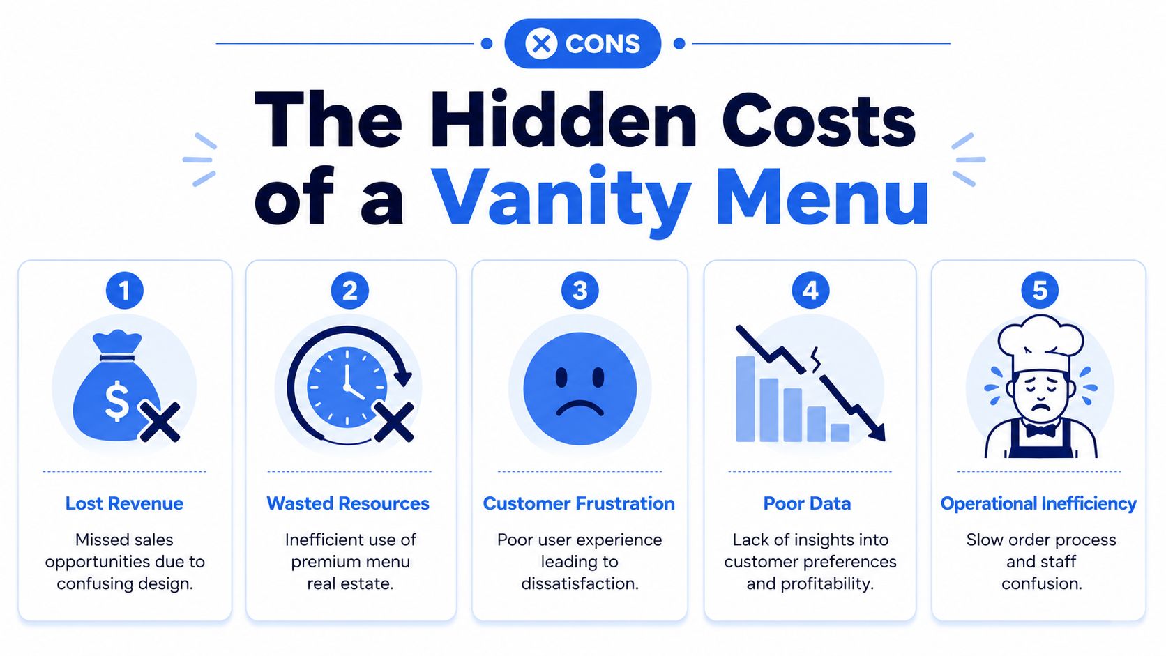
A vanity menu drains profit in small, repeated ways. Guests pick the item with the best photo instead of the item with the best margin. Staff miss add-ons because the menu does not support the sell. Managers put off price changes because every update means another print run, another round of edits, and another chance for inconsistency across channels.
Revenue leaks usually start with friction
Here is where owners lose money first.
- Guests hesitate instead of deciding: Too many equal-weight choices slow ordering and lower average check.
- High-value menu space goes to weak sellers: Your best visual positions should sell profitable items, not random fillers.
- Add-ons depend on staff memory: If the upsell lives only in the server script, it will be inconsistent.
- Price changes get delayed: Static menus make it harder to respond to food cost swings, daypart demand, and channel-specific pricing.
- Popular items crowd out profitable ones: Sales volume can look healthy while contribution margin stays soft.
That is why menu performance has to be measured by margin mix, not by how often an item gets ordered. A restaurant can stay busy and still leave money on the table every shift.
Pricing confusion kills conversion
Guests notice pricing gaps fast. They may not calculate your food cost, but they can spot inconsistency across dine-in, pickup, delivery, and your website. Once that happens, trust drops and checkout gets harder.
A polished menu does not protect you from that problem. It often makes it worse by hiding weak pricing logic behind good design. If a guest sees one price on your printed menu, another on your ordering page, and a third on a delivery app, they stop focusing on the food and start questioning the purchase.
If guests think you're hiding the actual price, they stop buying with confidence.
Fix the structure, not just the look. Build a menu that can support channel-based pricing, clear modifiers, and fast updates. A strong restaurant pricing strategy for menus and digital ordering protects margin and reduces the operational drag that comes from static, design-first menus.
A vanity menu is not only a branding problem. It creates slower decisions, weaker upsells, pricing doubt, and avoidable admin work. That combination cuts revenue and adds labor at the same time.
Optimize Your Menu Layout and Pricing Psychology
Most menu fixes don't require a rebrand. They require better selling structure.
Start with placement. Guests don't read menus like novels. They scan. Your job is to make the profitable path obvious without making the menu feel pushy.
Fix what guests see first
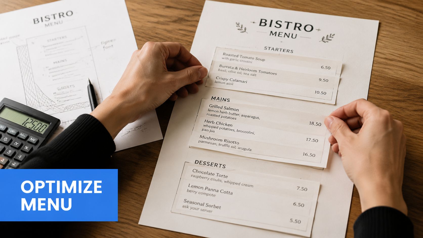
Use your best visual positions for items you want to sell.
That means:
- Lead with a strategic section: Don't open with a low-margin filler category if your signatures sit lower on the page.
- Highlight selectively: Box, shade, or label a small number of items. If everything is highlighted, nothing is.
- Shorten crowded categories: If guests see a wall of options, they delay instead of deciding.
- Group complements together: If tacos pair well with fries or a signature drink, don't separate them across the menu.
A simple rule works well. Give your strongest items the easiest path to attention.
Practical rule: Every menu section should have a clear first choice, a clear premium choice, and a clear add-on path.
Clean up price presentation
Price formatting changes behavior.
A lot of restaurants sabotage their own menu by making the guest think about money before food. If every line ends in a stark price column with repeated symbols and decimals, you're training the eye to compare cost, not crave the dish.
Use this checklist:
- Remove unnecessary dollar signs: It softens price salience.
- Drop trailing zeros where appropriate: "15" often reads cleaner than "15.00".
- Keep prices close to descriptions: Don't force the eye to zigzag across the page.
- Avoid sorting dishes by price logic alone: People shouldn't feel like they're scanning a spreadsheet.
For operators reviewing broader pricing structure, this guide to restaurant pricing strategy is worth using alongside your menu audit.
Make digital and print work together
Your print menu should sell the core offer. Your digital menu should handle speed, detail, and flexibility.
That means the printed version can stay tight while digital handles:
- modifier detail
- allergy notes
- rotating features
- late-night items
- direct ordering links
The video below is useful if you're rethinking how menu design and pricing work together in practice.
Owners often overdesign the page and underdesign the decision. Fix the decision first.
Engineer Profit with Smart Bundles and Upsells
Friday dinner service is full, your kitchen is moving, and tables are ordering one item at a time. An entrée goes out without the side that should have been attached to it. A round of drinks never gets suggested. Dessert does not come up until the check hits the table, which means it is already too late. That is not a sales problem. It is a menu engineering problem.
A vanity menu leaves money on the table because it treats every item like a separate decision. A profitable menu builds the next decision in.
Build bundles that increase ticket size without slowing the line
Start with combinations that fit how guests already order. Do not create bundles because they look clever on paper. Create them because they reduce hesitation, raise average spend, and keep production simple.
Use bundles in four places:
| Bundle type | What to pair | Why it works |
|---|---|---|
| Best seller combo | Popular entrée + easy side | Increases attachment on your highest-volume item |
| Premium trade-up | Familiar item + premium add-on | Raises spend without changing the core order |
| Group order set | Shareable item + two complements | Grows table checks fast |
| Late-night quick pick | Fast-moving item + drink or fries | Speeds ordering during rush periods |
The rule is simple. Bundle items that already belong together operationally. If the kitchen has to stop and think, the bundle is wrong.
Put upsells where the order is made
Many operators bury add-ons in a separate section or a long modifier list. That kills response. Guests buy the next logical thing when it appears at the exact moment they choose the main item.
Use tight prompts under the item name or description:
Vanity Tacos
Add truffle fries.Seafood Tower
Add a shareable pasta for the table.House Burger
Make it a combo with fries and a drink.
That structure works because it removes work for the guest and selling pressure from the server. It also cuts operational drag. Fewer open-ended questions at the table means faster ordering and fewer missed attachments.
A useful QR code menu for restaurants makes this easier to manage because you can place the upsell directly in the order flow instead of hoping staff remember the script.
Write offers like a merchant, not a designer
Words matter here.
“Add truffle fries” beats “extras available.” “Make it a combo” beats “served with optional sides.” “For the table” helps sell shareables because it frames the item around the group, not the price.
Keep the offer specific. Keep it short. Limit the choices. If every entrée can be paired with six sides, three proteins, and four sauces, you have not created an upsell. You have created friction.
Use this filter tomorrow:
- Attach one relevant add-on to each top seller
- Create one group bundle for shareable occasions
- Create one premium upgrade on a familiar item
- Remove low-response modifiers that clutter the decision
Treat bundles and upsells as revenue tools, not decoration. If the menu does not guide the next purchase, your staff has to do all the work by memory, and that is an expensive way to run service.
How Digital QR Menus Turn Insights into Revenue
Friday night. Your dining room is full, two items are 86'd, one supplier cost jumped this morning, and your printed menu is already wrong. That is how revenue leaks out of a restaurant. Guests order around missing items, staff waste time explaining substitutions, and managers keep making margin decisions with no control once service starts.
A digital menu fixes that if you use it as a selling system, not a digital flyer.
Static menus cost money in small, repeatable ways
The problem with a static menu is not just reprint cost. It locks in bad decisions.
If an item sells out, the guest still sees it. If food cost changes, your old price stays on the page. If a modifier causes confusion, staff keep explaining it table after table. Those are sales problems and labor problems at the same time.
A digital QR menu lets you fix those issues in minutes. You can change pricing, hide unavailable items, clean up modifier paths, and push a limited-time offer during the hours it will sell. That gives you control over margin during service, not after the damage is done.
The real value is operational control tied to revenue
Good digital menus do more than display items. They help you sell the right items with less friction and less staff dependency.
Use a system that can:
- Update instantly: Change prices, availability, descriptions, and modifiers without waiting for a reprint cycle.
- Guide add-ons in context: Show a relevant upgrade or side at the moment the guest is deciding, not buried at the bottom of the menu.
- Show where orders stall: Review what guests click, skip, or abandon so you can fix weak categories and confusing choices.
- Support different service windows: Run a tighter late-night menu, a brunch version, or an event menu without rebuilding everything manually.
- Reduce front-of-house workload: Let guests handle simple ordering steps themselves during peak periods.
A strong QR code menu for restaurants should be judged by how well it protects margin, improves order flow, and reduces staff friction.
Digital menus let you test changes that print menus bury for months
Many operators often miss the point. They move a PDF onto a phone and call it modern.
That does nothing for profit.
A proper digital setup lets you test changes fast. Move one high-margin item higher in a category. Rename a weak add-on so it reads like a purchase, not a footnote. Turn a low-performing section off for late night. Simplify a modifier stack that slows down guests and creates ticket errors. Then watch what changes in actual orders.
That feedback loop is the advantage. Print menus freeze bad assumptions. Digital menus let you correct them while service is still happening.
The best digital menu is an operating tool that helps you protect margin, speed up ordering, and sell more of what you actually want to move.
Your 3-Step Action Plan for a More Profitable Menu
Friday dinner rush. A guest scans your menu, hesitates, asks three questions, skips the add-on, and orders the cheaper entree. Your server spends two extra minutes explaining options. The kitchen gets a modifier-heavy ticket that slows the line. That is not a branding problem. It is a menu profit problem.
You fix it by treating the menu like a sales tool and an operations tool at the same time.
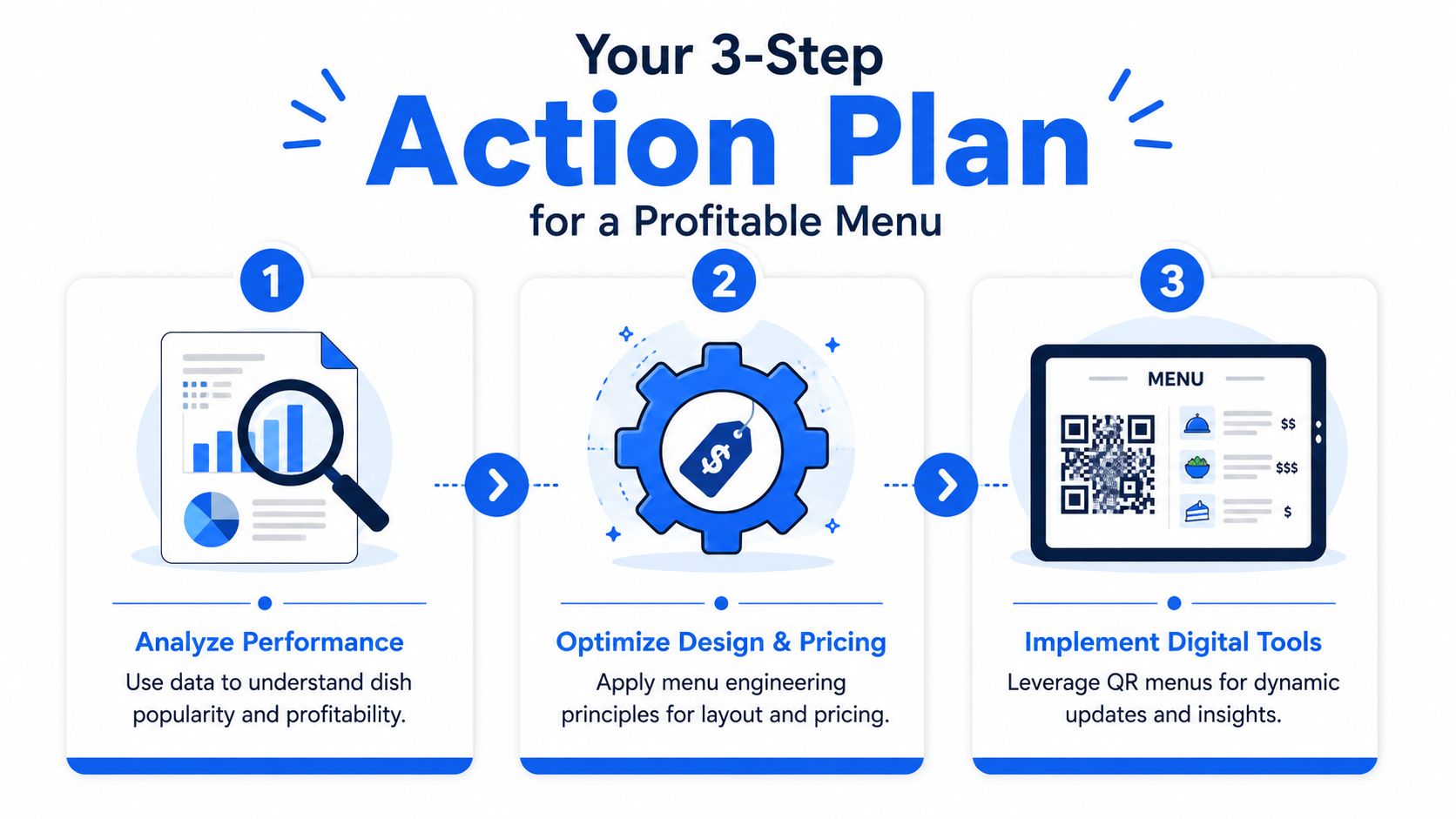
Step 1 Audit the menu like an operator
Review the menu with three questions in mind. What sells well. What earns well. What slows service.
Then look for the common revenue leaks:
- items getting prime placement without earning it
- categories with too many choices
- pricing that makes comparison too easy
- add-ons hidden instead of prompted at decision points
- menu sections that create questions, modifiers, or ticket errors
Be strict here. A beautiful menu that fails to guide choices costs you money every shift.
Step 2 Fix two selling problems this week
Do not wait for a full redesign. That is how weak menus survive for another six months.
Pick two changes you can implement now:
- move one high-margin dish higher in its category
- cut or combine one crowded section
- rewrite three add-on prompts so they sound purchase-worthy
- clean up price formatting to reduce bargain hunting
- build one bundle that raises average check without slowing the kitchen
This works because focused changes are easier to train, easier to measure, and more likely to stick.
Step 3 Put winning menu decisions into a digital system
Once the structure works, move it into a system you can update fast. Static menus trap bad pricing, weak placement, and outdated offers. Digital menus let you adjust in real time, based on what guests buy and what your staff can handle during service.
Use digital tools to run different menus by daypart, test upsells without reprinting, and remove friction from ordering when the room gets busy. That turns menu management from a design task into a margin discipline.
Fix the sales logic first. Then use technology to scale it.
If you're ready to turn a vanity restaurant menu into a revenue tool, take a serious look at RevMenue. It gives restaurants a faster way to update menus, push smarter upsells, track what sells, and reduce the drag that comes with static print. It's a practical next step for operators who want better margins without making service feel robotic.