
Most restaurants use a touchless menu qr code like a laminated shortcut to a PDF. That's the wrong job.
A QR menu shouldn't just replace printing. It should sell better than paper, load faster than a website search, reduce staff interruptions, and give you hard evidence about what guests buy. If it doesn't do those things, you've built a convenience feature, not a profit tool.
The lazy setup is everywhere. A code on the table. A clunky PDF. No ordering path. No add-ons. No tracking. No fallback when the signal is weak. Guests tolerate it, but tolerance doesn't grow check averages.
Consumer behavior has already moved on. Touchless QR menus are now standard in major markets. A QSR Magazine industry report cited by FlipMenu says more than 65% of full-service restaurants in the U.S. offered QR code menus by 2025, compared with under 5% in 2019, and 57% of consumers scanned a QR code at a restaurant in the past month. The same source says 82% of consumers felt comfortable scanning QR codes from businesses they recognize, up from 53% in 2021. Read the figures in FlipMenu's contactless dining summary.
Table of Contents
- Your QR Menu Is Leaking Profit Here's How to Fix It
- From PDF to Profitable Designing a High-Converting Digital Menu
- Generating and Placing QR Codes for Maximum Scans
- Turn Scans into Sales with Smart Upselling
- Measuring What Matters QR Menu Analytics
- Common QR Menu Problems and How to Solve Them
Your QR Menu Is Leaking Profit Here's How to Fix It
If your QR code opens a static menu and stops there, you're leaving money on the table.
Operators often defend that setup because it saves printing and makes updates easier. Fine. It also wastes the best digital selling moment in the dining room. A guest has their phone in hand, attention focused, and intent to buy. Sending that guest to a flat PDF is the restaurant equivalent of greeting a walk-in and then walking away.
The main issue isn't whether guests will scan. Scanning is already normal behavior in restaurants and payments. The issue is whether the scan leads to a smoother decision and a bigger check. As noted in Scanbuy's QR code business article, the revenue tradeoff between QR menus and upselling quality is the critical factor, especially as global QR code payments were projected to reach trillions of dollars by 2025.
Your QR menu is either shortening the path to purchase or adding one more layer of friction.
Three profit leaks show up again and again:
- PDF friction: Guests pinch, zoom, scroll, and miss key items.
- No commercial path: The menu informs, but it doesn't nudge, recommend, or convert.
- No measurement: Management can't tell what gets viewed, ignored, or abandoned.
A better setup changes the role of the menu entirely.
Instead of acting like a digital flyer, it becomes a working sales surface that can:
- Guide choices: Put high-margin items where attention naturally goes first.
- Reduce staff drag: Let guests browse without waiting for someone to explain basics.
- Speed turnover: Faster decisions usually mean faster ordering.
- Improve consistency: Every table sees the same recommendations, every shift.
Stop treating it like a hygiene tool
The pandemic made QR menus acceptable. That phase is over.
Now guests judge them the same way they judge any other digital experience. If the page is slow, ugly, confusing, or impossible to use on a small screen, they notice. If it helps them order quickly and spot a great add-on, they notice that too.
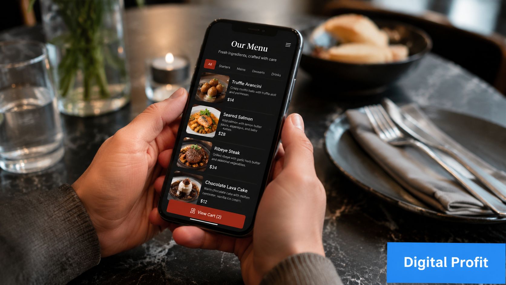
From PDF to Profitable Designing a High-Converting Digital Menu
A touchless menu qr code only works as well as the page behind it. Most restaurants spend time generating the code and almost none designing the destination.
That's backwards.
Stop sending guests to a dead document
A PDF is fine for email attachments and printer shops. It's a poor dining interface.
Here's the difference in practical terms:
| Format | What guests experience | What you get |
|---|---|---|
| PDF menu | Pinch, zoom, hunt, give up | Minimal control, no real optimization |
| Mobile menu page | Tap, browse, compare, add | Better flow, clearer merchandising |
| Interactive ordering menu | Tap, customize, add-on, order | Stronger conversion and cleaner data |
A profitable digital menu should feel native to the phone. That means no tiny text, no oversized file, and no dead-end layout copied from a print menu.
Practical rule: If a guest has to zoom, your menu is already underperforming.
Build for thumbs not desktops
Good digital menu design is less about beauty and more about decision speed.
Use these rules:
- Lead with the money-makers: Put profitable signatures, bundles, and high-confidence sellers near the top of each category.
- Keep category names obvious: “Starters,” “Burgers,” “Cocktails,” and “Desserts” beat clever labels that force guests to think.
- Write short descriptions: Mention what matters most. Flavor, standout ingredient, dietary cue, or preparation style.
- Make modifiers painless: Add-ons, sides, temperatures, and extras should take one or two taps, not a maze of screens.
- Use photos selectively but well: Strong images help when they reduce uncertainty. Bad images cheapen the menu.
- Show pricing clearly: Hidden price friction kills trust fast.
- Load fast on mobile data: If the page drags, guests blame the restaurant, not their signal.
Here's a realistic contrast.
A café posts a QR code that opens a six-page brunch PDF. Guests zoom around, can't tell what comes with what, and ask staff the same questions all morning. The team still explains options table by table, so labor savings never materialize.
A second café uses a mobile menu with clear sections, visible add-ons like extra shot, oat milk, avocado, and pastry pairings, and obvious buttons for ordering or calling staff. That menu does more than display products. It helps guests complete a decision.
What to include on every digital menu page
Don't overcomplicate it. Most restaurants need these essentials:
- Clear item names
- Readable prices
- Concise descriptions
- Optional add-ons
- Allergen or dietary markers
- Photos where they improve confidence
- Simple path to order, pay, or call for help
If you run multiple dayparts, separate them cleanly. Breakfast guests don't want to scroll through cocktails. Dinner guests don't want to hunt through coffees to find wine.
Generating and Placing QR Codes for Maximum Scans
A QR code that looks nice but fails in real conditions is useless. Treat rollout like QA, not print design.
The operational guidance is straightforward. Sunday's QR ordering rollout advice recommends placing the code at eye level, using a clear CTA such as “Scan to Order,” printing at high resolution with strong contrast, testing across multiple iOS and Android devices, and checking both Wi-Fi and cellular. It also stresses keeping a fallback, like paper menus, when the network fails.
Static vs dynamic is a business decision
A lot of operators pick whichever QR code is easiest to generate. That's short-term thinking.
| Feature | Static QR Code | Dynamic QR Code |
|---|---|---|
| Destination link | Fixed | Can be updated |
| Reprint needed after URL change | Usually yes | No |
| Tracking capability | Limited | Strong |
| Best use | Basic one-page access | Ongoing optimization and multi-location control |
| Operational value | Cheap to launch | Better for testing and management |
If you want to compare systems built for restaurant use, review tools that support updates, analytics, and menu management, such as this guide to QR code menu software for restaurants.
Placement matters more than design flair
Most scan failures happen because the code is in the wrong place or introduced badly.
Use placements that match behavior:
- Table tents: Best for dine-in discovery and repeat visibility during the meal.
- Host stand signage: Good for queues and walk-in browsing before seating.
- Bar top displays: Useful where guests often order in rounds.
- Takeaway counters: Ideal for quick-service and café add-ons while waiting.
- Receipt or packaging inserts: Smart for loyalty, reorders, and feedback.
And don't make guests guess. Add direct language:
- Scan to view menu
- Scan to order
- Scan for drinks and specials
That tiny instruction matters. People scan more readily when the next step is obvious.
Test your code under bad conditions, not just in the office. Dim light, older phones, crowded Wi-Fi, cracked screens. That's the real dining room.
A few details operators overlook:
- Contrast wins: Black on white is boring and effective.
- Avoid overstyled codes: Brand color is fine. Scannability matters more.
- Check print quality: Fuzzy tabletop prints create avoidable service delays.
- Review landing page speed: The scan is only half the job.
Turn Scans into Sales with Smart Upselling
The biggest upside of a touchless menu qr code isn't contactless access. It's controlled upselling.
That's where digital menus outperform paper and often outperform tired staff in the middle of a rush. A server can forget to offer a side, skip a pairing, or rush through dessert. A well-built menu prompt doesn't.
Here's the flow you want guests to move through:
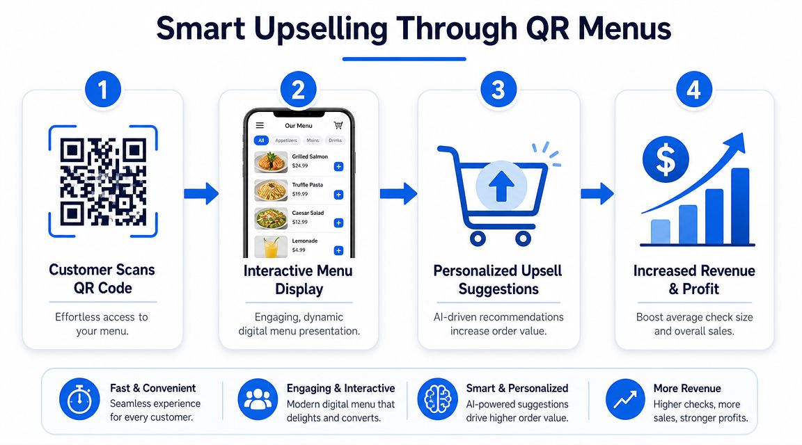
The commercial case is clear. Sauce's breakdown of QR code menus says some restaurants have seen up to 60% higher average order value when digital ordering is combined with upselling prompts, and it notes that dynamic QR codes can track scans, timestamps, location, device type, pageviews, and session behavior.
The menu should recommend the next click
Most operators bury add-ons at the bottom or leave them to staff. That's lazy design.
Smart upselling is simpler than people think:
- Pair with intent: If someone opens burgers, show fries, loaded fries, and drinks nearby.
- Use one-tap extras: “Add avocado,” “double patty,” “extra cheese,” or “make it a combo” should be frictionless.
- Promote profitable upgrades: Premium mixers, better sides, dessert add-ons, and second-drink prompts often beat discounting.
- Bundle where it helps: Guests like easier choices. Operators like cleaner ticket growth.
For practical examples, this roundup of restaurant upselling techniques is a useful reference point.
Use prompts that help the guest decide faster
Watch this example in motion:
A good prompt doesn't feel pushy. It feels helpful.
Compare these two approaches:
- Weak: “Would you like anything else?”
- Better: “Add truffle fries” or “Make it a meal”
One is vague. The other removes decision effort.
This matters even more when the floor is busy. Your staff should spend time on hospitality, exceptions, and table recovery. They shouldn't have to manually chase every extra topping or second beverage opportunity.
The best upsell is the one the guest accepts without needing help.
Use menu psychology that supports easy yeses:
- Put premium options near the base item
- Show upgrades before checkout
- Keep option names concrete
- Limit choice overload
- Feature high-margin items with confidence, not clutter
Measuring What Matters QR Menu Analytics
Most restaurants track scans and stop there. That's not analysis. That's counting.
A QR menu only becomes a management tool when you connect guest behavior to menu engineering, staffing, and revenue decisions.
Start with the dashboard view below, then go deeper.
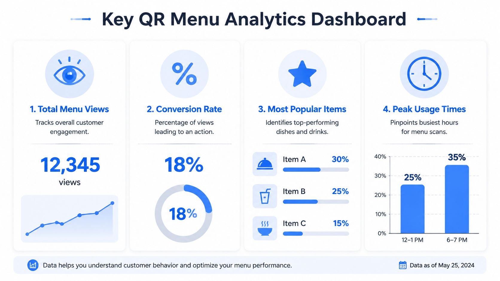
Track behavior not just scans
The most useful menu data answers operational questions.
Look for signals like these:
- Entry points: Which tables, zones, or placements generate the most scans?
- Category attention: Do guests spend time on cocktails, desserts, or specials?
- Drop-off points: Where do people stall, leave, or abandon the flow?
- Add-on acceptance: Which prompts get ignored and which convert?
- Time patterns: Do ordering habits shift by lunch, dinner, or late-night service?
This is why dynamic codes matter. They give operators more than access. They provide a trail of decisions.
A platform that consolidates those signals can simplify the work. For example, restaurant data analytics tools can help teams view item movement, timing patterns, and menu interactions in one place instead of guessing from POS summaries alone.
Turn menu data into operating decisions
Useful analytics should change what you do next week, not just what you discuss in meetings.
For example:
| Signal | Likely issue | Action |
|---|---|---|
| High views, low orders on a category | Poor descriptions, pricing friction, weak photos | Rewrite, reposition, or simplify |
| Frequent exits after item click | Modifier overload or confusion | Reduce steps and clarify options |
| Strong scans but weak upsells | Prompt timing or offer mismatch | Test better pairings |
| Heavy traffic at one daypart | Menu structure misaligned to service period | Reorder sections for that window |
If guests repeatedly view an item but don't order it, the problem usually isn't demand. It's presentation.
The point isn't to create a mountain of reports. It's to make smaller, faster decisions:
- remove underperforming clutter
- improve item naming
- reposition profitable dishes
- test different add-ons
- tighten categories by daypart
- give staff better talking points based on what guests already click
That's how a QR menu stops being a digital replacement and starts acting like a sales diagnostic.
Common QR Menu Problems and How to Solve Them
A touchless menu qr code has to work for everyone, not just your youngest guests with new phones and unlimited data.
That's where many setups break down. Operators assume scanning is universal. It isn't. Wasserstrom's guide to touchless menus notes that smartphone adoption is high but not universal, especially among adults 65+ and lower-income households, and it highlights the need for accessible design and fallback options when QR alone isn't enough.
Guest friction you can prevent
Common problems usually have simple fixes.
- Older phone or weak camera: Add a short URL below the code so guests can type it manually.
- Poor eyesight: Offer large-text printed menus and make the digital menu readable without tiny text.
- Weak signal inside the venue: Keep a paper backup and make sure staff can step in quickly.
- Screen reader issues: Use accessible page structure, clear labels, and simple navigation.
- Guests who dislike scanning: Don't argue. Hand them a menu and keep service moving.
A QR menu should widen access, not narrow it.
Keep hospitality in the system
Restaurants get into trouble when they force technology into moments where service should feel easy.
Your process should be simple:
- Present the QR menu as the fastest option.
- Keep a non-digital fallback ready.
- Train staff to spot hesitation and help immediately.
- Make sure the digital path is readable, fast, and uncluttered.
- Review guest friction regularly, not just technical uptime.
Privacy matters too. If your system collects data, be clear about what you track and why. Keep consent language visible and avoid adding unnecessary steps before guests can see the menu.
Used well, a QR menu reduces workload, supports faster service, and improves the guest experience. Used badly, it creates awkward moments your staff then have to repair.
If you want a practical way to turn menu scans into stronger margins, RevMenue is built for that job. It supports fast-loading QR menus, instant updates, add-on prompts, and revenue analytics while fitting alongside existing POS and payment tools, which makes it a sensible option for restaurants that want more than a digital PDF.