
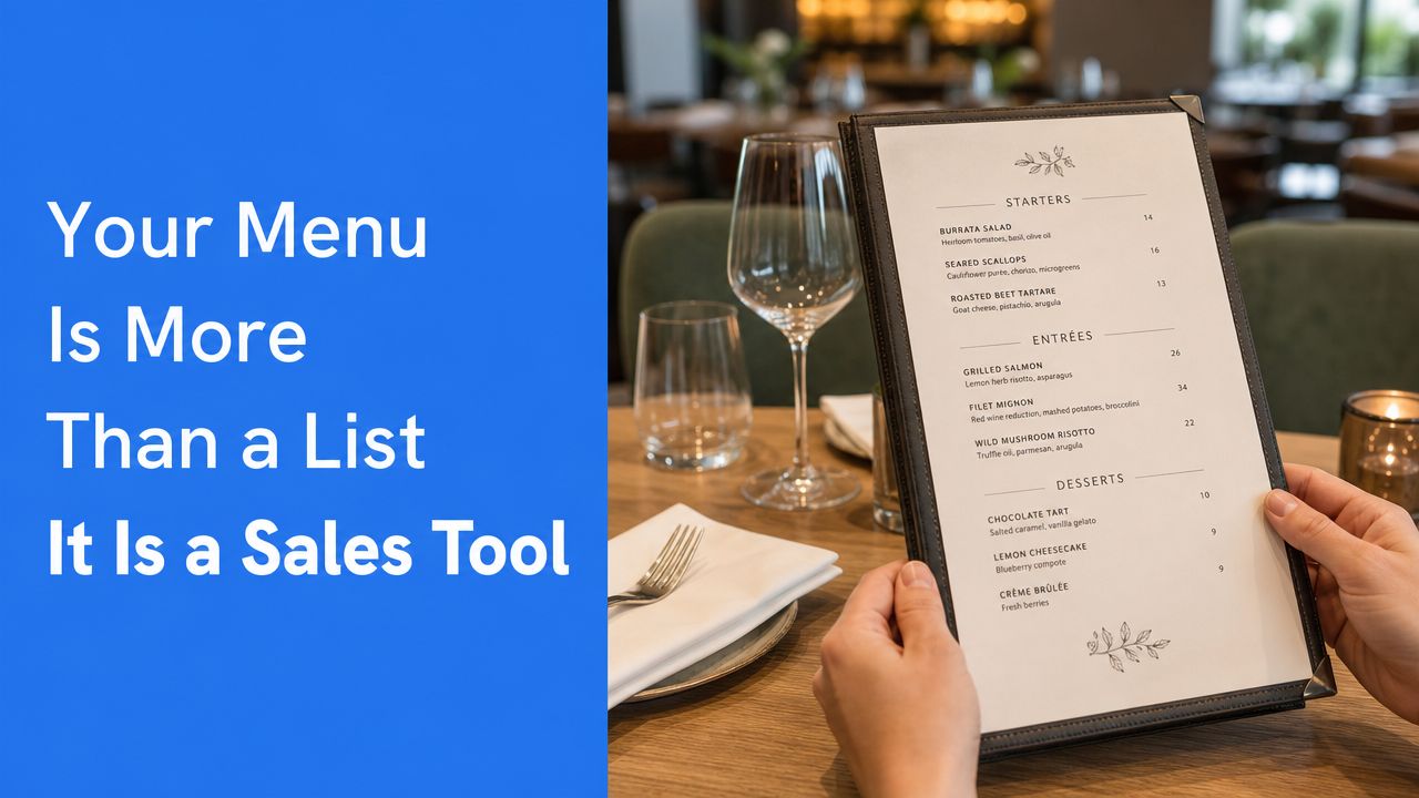
Most sushi counters leave money on the table because they treat the menu like a product list. That's backwards. The menu is the sales system.
That matters in a category with real scale. The worldwide sushi restaurants market is estimated at USD 9.1 billion in 2024 and projected to reach USD 13.7 billion by 2030, implying a 7.0% CAGR over the period, according to Strategic Market Research's sushi restaurants market outlook. If you're running a sushi counter, you're not in a niche hobby business. You're competing in a large, growing market where menu clarity, speed, and margin discipline decide who wins.
There's also a deeper reason this format works. The modern sushi counter menu traces back to Edo-period Japan. In 1824, Yohei Hamaya opened a sushi stall in Edo and introduced nigiri-style sushi made from vinegared rice and fresh fish, cutting preparation from hours or days to a matter of minutes and helping sushi become affordable urban fast food, as described in this history of sushi. Speed has always been part of the format. Your menu should protect that advantage, not bury it under clutter.
Table of Contents
- Your Menu Is More Than a List It Is a Sales Tool
- Architecting a Profitable Sushi Menu Core
- Smart Pricing Portioning and Perceived Value
- Menu Layout and Design That Sells
- Activating Your Menu with QR Codes and Upsells
- Using Data to Iterate and Improve Your Menu
Your Menu Is More Than a List It Is a Sales Tool
Most operators build a sushi counter menu by asking, "What do we serve?" The better question is, "What do we want guests to buy, and how fast can the station execute it?"
If your menu only lists nigiri, rolls, hand rolls, and sides, you're making guests do the work. They have to compare formats, guess portions, and build their own order logic. Some will buy anyway. Many will default to the safest, smallest order.
A good menu does four jobs at once:
- Directs demand toward items your team can execute cleanly at rush.
- Raises average order value with bundles, add-ons, and better sequencing.
- Reduces friction for first-time guests who don't understand the format.
- Protects labor efficiency by steering orders into repeatable builds.
Practical rule: If a guest needs staff to explain your menu every few minutes, the menu isn't finished.
Many sushi counters get stuck, believing menu engineering is a luxury for large groups or chef-driven concepts. It isn't. It's basic operating discipline. Counter formats are especially sensitive because they rely on compact stations, fast turns, and clear guest choices.
A smart sushi counter menu is also a marketing asset. It shapes what guests photograph, what they reorder, and what they remember. If you need a broader framework for that process, restaurant menu optimization strategies from RevMenue are worth reviewing.
Why operators underuse the menu
The common mistakes are predictable:
- Too many low-volume items: One obscure topping or sauce creates extra prep, extra storage, and extra training.
- Flat presentation: Every item gets equal weight, so guests can't see what to order first.
- No value ladder: There's nothing between a small individual order and a premium experience.
- Weak naming: "Salmon hand roll" sells less effectively than a named set or recommended sequence.
What a sales-driven menu looks like
Think of the menu as your best front-of-house employee. It should guide people from entry point to add-on without pressure.
A well-built sushi counter menu usually makes the first decision simple. Start here. Choose à la carte. Pick a set. Add one side. Add a drink. That sequence sounds basic. It isn't. It's how you stop indecision from killing spend and slowing the line.
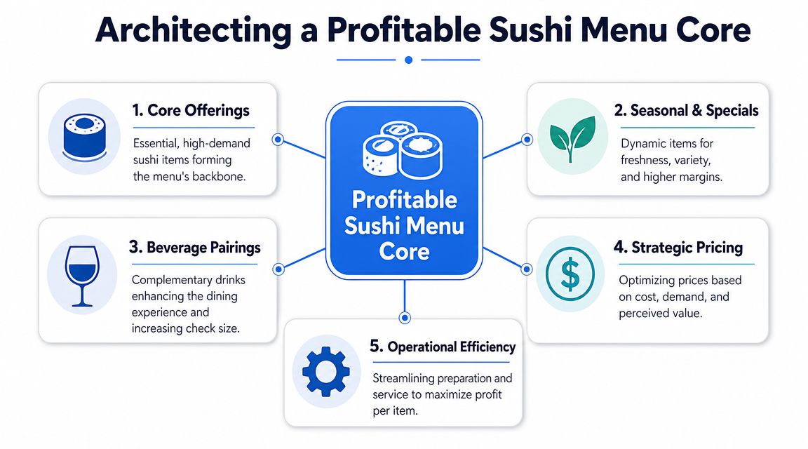
Architecting a Profitable Sushi Menu Core
The fastest way to wreck a sushi counter is to build the menu around chef ambition instead of station reality. Keep the craft. Lose the chaos.
Industry guidance is clear that a technically efficient sushi counter menu should be designed around station workflow, not just the dish list. The station should support the three core inputs of rice, fish, and water, with nearby dry ingredients, a hand sink, reach-in refrigeration, a 3-compartment sink, and a dedicated sushi refrigerator to reduce motion waste and temperature-control risk, according to Foodservice Equipment & Supplies guidance on creating efficiencies in sushi stations.
Build from the station, not from your wish list
Start with what your counter can produce repeatedly with low friction. That means shared mise en place, short reach paths, and minimal cross-traffic.
Use this test before adding any item:
| Menu question | Good answer | Bad answer |
|---|---|---|
| Does it reuse core ingredients? | Uses existing rice, nori, fish, garnishes | Needs unique prep for one SKU |
| Can it be assembled quickly at the counter? | Simple finishing, clear build order | Multiple garnish steps and custom plating |
| Does it fit peak service? | Works during rush without slowing others | Only works when volume is light |
| Does it add range without adding complexity? | New choice from existing components | New sauce, new topping, new station movement |
If an item fails that test, don't launch it. Specials can be exceptions. Core menu items shouldn't be.
Use a tight core and a short edge
Your base menu should be narrow and strong. Then add a small layer of premium or seasonal options.
A commercially sound structure usually looks like this:
- Core staples: Standard maki, straightforward nigiri, and hand rolls built from shared proteins and garnishes.
- Signature items: A limited set of higher-perceived-value rolls or cones that feel special but don't require a second station.
- Bundles and sets: Curated combinations that simplify ordering and raise spend.
- One rotating feature: Seasonal fish, chef's selection, or a limited run pairing.
That architecture keeps the menu easy to shop and easier to execute.
The menu should reflect how the counter works at full speed, not how the chef thinks on a calm afternoon.
Match formats to throughput
Not every sushi format behaves the same in service. Maki is built by layering nori with vinegared rice and fillings, then rolling and slicing. Temaki is assembled individually into a cone. That difference matters in rush periods, as outlined in WebstaurantStore's overview of sushi formats.
Here's the practical move:
- Put high-throughput items in the center of the menu during peak trading.
- Push more assembly-heavy builds into quieter dayparts, limited features, or premium sets.
- Reuse the same proteins across nigiri, maki, and hand rolls so prep supports multiple SKUs.
- Limit one-off sauces and decorative finishes that create extra handling.
A workable example
Say your proteins are salmon, tuna, shrimp, and one rotating special. That gives you a strong menu spine:
- Nigiri selection from those proteins
- Basic maki using the same proteins
- Hand rolls using the same proteins plus shared crunch or sauce
- A chef set combining the best sellers
- Two side dishes that support attachment without slowing production
That's enough to feel varied without becoming messy.
The architecture mistake I see most
Operators often chase variety when they should chase repeatability. They add specialty toppings, custom sauces, and too many premium modifiers. The result is slower service, higher waste, and a menu that's harder to train.
A profitable sushi counter menu is compact on purpose. Guests don't need endless choice. They need confidence, clarity, and a reason to add one more item.
Smart Pricing Portioning and Perceived Value
Most sushi counters underprice the middle of the menu and overcomplicate the top. That's why guests either buy too little or hesitate too long.
Pricing isn't only about covering food cost. It's about shaping the choice architecture. You want the menu to make the right order feel obvious.
Price for decision-making, not just food cost
A smart sushi counter menu should have a clear value ladder.
Use three layers:
- Entry point: Simple, easy first orders for cautious or first-time guests.
- Best-value middle: Sets, trios, or combinations that feel like the sensible choice.
- Premium anchor: Chef selections or upgraded assortments that make the middle feel more accessible.
That premium anchor matters even when it isn't the volume driver. It helps frame the rest of the menu. If your most complete experience sits visibly above the middle tier, many guests will move up from a basic single-item order to a better-value set.
Here's the mistake. Operators often present all items as isolated line entries with no context. That forces guests to compare piece by piece. It slows decisions and weakens perceived value.
A better setup is to group by buying intent:
| Guest intent | Better menu format |
|---|---|
| I want something quick | Lunch set, trio, simple combo |
| I want to choose my own | À la carte nigiri, rolls, hand rolls |
| I want the best experience | Chef set, premium assortment |
If you want a useful parallel from another format, this guide to menu pricing and portion strategy shows the same commercial principle. Clear pricing structure beats raw item sprawl.
Portion logic must be obvious
If guests can't tell what they're getting, they default to caution.
Spell out the format clearly:
- Piece counts: State them consistently where relevant.
- Set contents: Name what is included, not just the set title.
- Portion differences: Explain why one option costs more. More pieces, premium fish, or chef-selected variety.
If the guest has to ask, "How much food is that?" you've already created resistance.
Portioning also affects margin discipline. An oversized roll might look generous, but if it slows assembly and reduces attachment to sides or drinks, it may not be your best seller in business terms. The strongest portion size is the one guests perceive as fair and easy to understand while leaving room for one add-on.
Practical pricing moves that work
- Keep the middle visible: Your best-value sets should sit where people see them early.
- Name bundles for the occasion: Lunch, quick bite, chef pick, date night.
- Use premium items as anchors: Not as clutter, but as a framing device.
- Avoid chaotic modifiers: Endless add-ons create hesitation and service errors.
A sushi counter menu should make spending feel smart, not risky. That's how you protect both guest confidence and margin.
Menu Layout and Design That Sells
A badly designed menu creates dead space in the guest's decision process. A strong one keeps them moving.
Most sushi counter menus fail visually in one of two ways. They either look cramped and technical, or they look elegant but vague. Neither sells well.
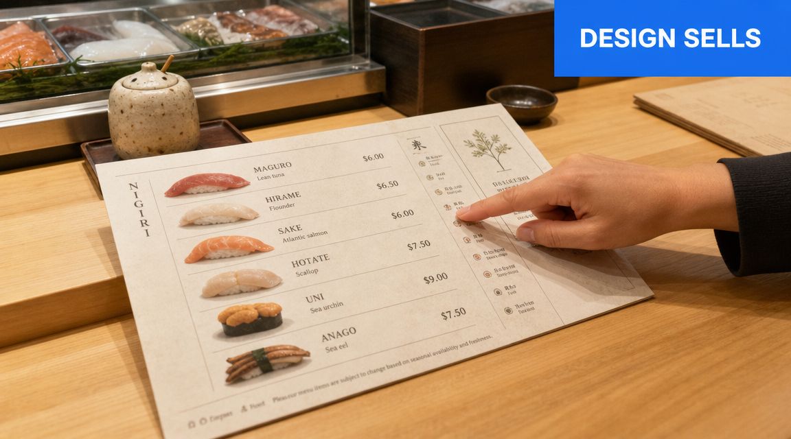
Lead the eye to profitable decisions
Don't design the page like an inventory sheet. Design it like a guided path.
Use this layout order:
- Start with featured sets or signatures
- Then show core à la carte categories
- Then place sides, drinks, and add-ons
- End with premium selections or chef features
That order mirrors how people buy. First they want orientation. Then they compare. Then they add.
Your most profitable and most operationally reliable items should get the cleanest placement. Use whitespace, short descriptions, and restrained emphasis. Don't bold everything. If everything shouts, nothing stands out.
Write like a host, not like a spreadsheet
Names and descriptions matter. Not because guests need poetry, but because they need clarity plus appetite.
Compare the difference:
- Weak: Spicy tuna roll
- Better: Spicy Tuna Roll, tuna, chili mayo, cucumber
- Best for selling: Spicy Tuna Roll, tuna, cucumber, chili mayo, balanced for a quick lunch or easy add-on
The best copy answers the buying question. What is it, what's in it, and why should I choose it?
Use plain language for allergens and key ingredients. Don't bury them in symbols nobody understands. A cluttered allergy system makes the menu harder to scan and doesn't improve trust.
Good menu design removes uncertainty before staff need to step in.
Checklist for a selling layout
- Limit visual noise: Too many boxes, icons, and fonts make choices harder.
- Group by format: Nigiri with nigiri, hand rolls with hand rolls, sets with sets.
- Highlight one decision at a time: Featured set, recommended add-on, premium option.
- Keep descriptions short: Enough to inform, not enough to overwhelm.
- Use consistent naming: Don't call one item a cone, another a hand roll, and a third a temaki unless you're explaining the difference clearly.
Print and digital should follow the same logic
The medium changes. The selling principles don't.
A printed counter card should be fast to scan from a standing position. A digital menu should be fast to scroll on a phone. In both cases, clarity beats decoration. Guests want to order confidently. They don't want to decode your concept.
Activating Your Menu with QR Codes and Upsells
A static sushi counter menu can inform. A digital one can guide, clarify, and sell.
That's a bigger advantage in sushi than many operators realize. Public-facing counter menus are often sparse, which creates confusion for first-time diners about what a counter menu includes, whether it's prix fixe, a set, or à la carte. That gap is visible in consumer-facing listings like the Sushi Counter East Village listing on Postmates, where featured items appear without much explanation of format, structure, or best-value combinations.
A digital menu solves that immediately if it's built well. Not a PDF. Not a screenshot of the printed menu. A real mobile-first ordering flow.
Fix the format confusion first
The first screen should answer four questions fast:
- What kind of menu is this? Set menu, hand roll bar, à la carte, chef selection.
- How much food am I getting? Piece counts, hand roll count, or what's included in a set.
- What's the best first order? Staff picks, best sellers, lunch options.
- What can I add easily? Soup, edamame, extra hand roll, drink.
If those answers aren't visible early, guests hesitate. And when guests hesitate on mobile, they often order less.
A strong QR menu also reduces staff repetition. Instead of answering the same basic questions over and over, your team can spend time on hospitality, recommendations, and pacing.
For operators exploring that route, QR code menu tools for restaurants are worth evaluating based on speed, editability, and upsell controls.
Turn the menu into a quiet upseller
Upselling at a sushi counter shouldn't feel pushy. It should feel useful.
Good digital prompts happen at the right moment:
- A guest selects a hand roll set. Offer miso soup or edamame.
- A guest builds an à la carte order. Suggest a chef-selected combo instead.
- A guest chooses a premium fish item. Offer a sake or tea pairing.
- A guest stops at a light order. Prompt one small add-on that complements it.
That works because the suggestion is relevant to the decision already in progress.
Bundle for simplicity, not just for margin
The best bundles do three things. They simplify ordering, improve perceived value, and fit the station.
Examples that usually work well:
| Bundle type | Why it sells | Why operations like it |
|---|---|---|
| Hand roll trio | Easy entry point for first-timers | Shared mise en place |
| Lunch combo | Feels fast and complete | Predictable production |
| Chef assortment | Adds premium framing | Controlled item mix |
| Side plus drink add-on | Low-friction upsell | Minimal service disruption |
Digital menus handle this better than print because you can change bundles quickly, test sequencing, and update photos or descriptions without reprinting.
A short demo makes the point more clearly:
What to avoid
Don't overload the QR experience with every possible modifier. Sushi counters win on curation.
Skip these mistakes:
- Nested choices everywhere: Too many taps kill momentum.
- Unclear categories: Guests shouldn't wonder where sets end and à la carte begins.
- Generic photos: If imagery doesn't match the actual experience, trust drops.
- No recommended path: The menu should steer, not just display.
The strongest digital sushi counter menu feels like a calm host standing beside the guest, helping them build a better order without slowing the counter down.
Using Data to Iterate and Improve Your Menu
Launching the menu isn't the finish line. It's the start of the feedback loop.
Too many operators make menu decisions from instinct alone. Instinct matters, but once the menu is live, the numbers in your POS and digital ordering flow should decide what stays, what moves, and what gets cut.
Track decisions, not vanity
You don't need a complicated analytics stack. You need a short list of useful signals.
Focus on:
- Item popularity: What guests choose most often.
- Margin by item: Which products contribute.
- Attachment behavior: Which sides, drinks, or add-ons pair naturally with core items.
- Set performance: Which bundles simplify ordering and which ones get ignored.
- Drop-off points: Where guests stop adding and check out.
Those signals tell you more than broad sales totals ever will.
The best menu meetings start with three questions. What sells, what earns, and what slows the counter?
Make small menu changes fast
You don't need a full redesign to improve results. Most gains come from small, direct adjustments.
Try changes like these:
- Move one underperforming item out of a prime position.
- Rename a confusing set so the value is clearer.
- Replace a weak add-on with one that fits the same station flow.
- Cut an item that creates prep drag without earning its place.
- Promote a strong seller that guests overlook because the description is flat.
Use a simple review rhythm. Pull the data, review the menu, make a few deliberate edits, then watch how behavior changes. That's how strong operators keep a sushi counter menu sharp without creating operational churn.
The payoff of iteration
Menu architecture, pricing, layout, and digital ordering all compound when you manage them together. A cleaner menu sells more confidently. A better sequence lifts add-ons. A tighter item mix speeds production. Better data helps you repeat what works and remove what doesn't.
That is how a menu stops being a document and starts acting like an asset.
If your current menu is static, hard to update, or leaving upsells to chance, RevMenue is worth a look. It helps restaurants turn QR menus into revenue tools with fast updates, smarter bundles, and analytics that make menu decisions easier across one location or many.