
A packed service can still end with disappointing numbers. You feel the room was busy, staff were moving, tickets were flying, and yet sales land below what the night should have produced. Or the opposite happens. Sales are strong, but the kitchen burns time on a bottleneck, a top seller runs out, and tables stall during your most valuable hour.
That gap usually isn't effort. It's visibility.
Most operators don't need more reports. They need a real time analytics dashboard that shows what's changing while the shift is still salvageable. If average check size slips, if table turnover slows, if a bundle underperforms on digital ordering, you need to see it before the last covers leave. Used well, live data helps you protect margin, push the right upsell, and reduce staff workload. Used badly, it turns into noise and second guessing.
Table of Contents
- Stop Guessing Why a Good Night Went Bad
- What a Real-Time Dashboard Actually Is for a Restaurant
- The Only KPIs That Actually Boost Restaurant Profits
- Putting Your Data to Work Practical Scenarios
- How to Avoid Common Real-Time Data Traps
- Choosing a Dashboard That Works With Your Restaurant
Stop Guessing Why a Good Night Went Bad
Most restaurants lose money in the cracks between service, sales, and menu decisions. A Friday dinner can feel strong on the floor while profit leaks in three places at once. Tables sit too long after mains, the wrong items get pushed, and one station slows down the whole room.
By the time the end of day report confirms it, the shift is over.
A useful dashboard closes that gap. It tells you what's happening now, not just what happened. If table turnover starts slipping, if kitchen ticket times drift, or if digital orders shift away from high-margin add-ons, the manager can act while guests are still in seats.
What goes wrong without live visibility
- Sales look healthy but mix is weak: You sold plenty, but too much volume came from lower-profit items.
- Staff solve the wrong problem: The floor blames demand, while the underlying issue is one overloaded prep or pass station.
- Promotions run too long: A bundle that looked smart at lunch keeps dragging average order value into dinner.
- Inventory surprises hit peak service: A key item runs short because no one saw demand building early enough.
Practical rule: If a manager can't take action from a metric during the current shift, it probably doesn't belong on the live screen.
The best operators don't stare at charts all day. They use a short list of live signals to answer simple, profitable questions:
- Are guests spending the way they should?
- Is service speed helping or hurting turnover?
- Is the menu guiding people toward better choices?
- Is the team reacting early enough to protect the rush?
That's where a real time analytics dashboard earns its keep. It turns a vague bad feeling into a clear operational cause. Then it gives the manager a chance to fix it before revenue is gone for good.
What a Real-Time Dashboard Actually Is for a Restaurant
A restaurant dashboard should work like the display in your car. You don't drive by checking total mileage. You drive by watching speed, fuel, temperature, and warnings that need action now.
A restaurant is the same. Historical reporting matters, but live service runs on current signals. You need to know what's moving this shift, not what looked interesting last month.
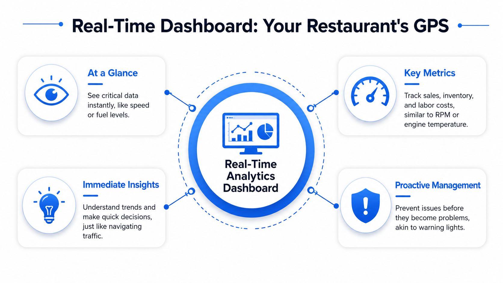
Think like a car dashboard, not a monthly report
In hospitality, real time doesn't need to mean millisecond obsession. For menu analytics, it's more practical to define real time as 1–30 seconds latency, which is fast enough for crews to adjust staffing or inventory before the next rush. In the same benchmark, that faster feedback loop correlated with a 15–20% increase in promotion conversion rates because operators could test and roll back offers instantly, as outlined in this restaurant menu analytics architecture example.
That matters because restaurant decisions usually happen in short operational windows. You're not changing a yearly pricing model at 7:15 p.m. You're deciding whether to keep pushing a combo, whether to pause a slow seller, or whether a station needs support before the queue worsens.
A dashboard built for that job should show fresh numbers, clear trend direction, and obvious next actions. It shouldn't bury the shift lead under twenty widgets.
What belongs on screen during service
Real-time monitoring and deep analysis are different jobs. During service, the screen should stay focused and operational.
That usually means a small set of live metrics such as:
- Sales flow: Current sales pace, average check size, and channel mix.
- Menu movement: What's selling now, what's stalling, and whether upsell prompts are landing.
- Service pressure: Ticket times, open orders, and turnover movement.
- Confidence signals: Last updated timestamps, so the team trusts what they're seeing.
A live dashboard should help the next decision, not create a meeting in the middle of dinner.
If you're comparing tools, most generic business dashboards fall short. They can display data, but they aren't shaped around hospitality actions. A restaurant team needs something closer to a service console than a finance report. That's why operators usually get more value from software designed around restaurant workflows, such as restaurant analytics software built for hospitality teams.
The Only KPIs That Actually Boost Restaurant Profits
Restaurants don't need more metrics. They need fewer metrics tied directly to profit, speed, and guest behavior. If a number doesn't change pricing, staffing, menu placement, or upselling, it's probably dashboard clutter.
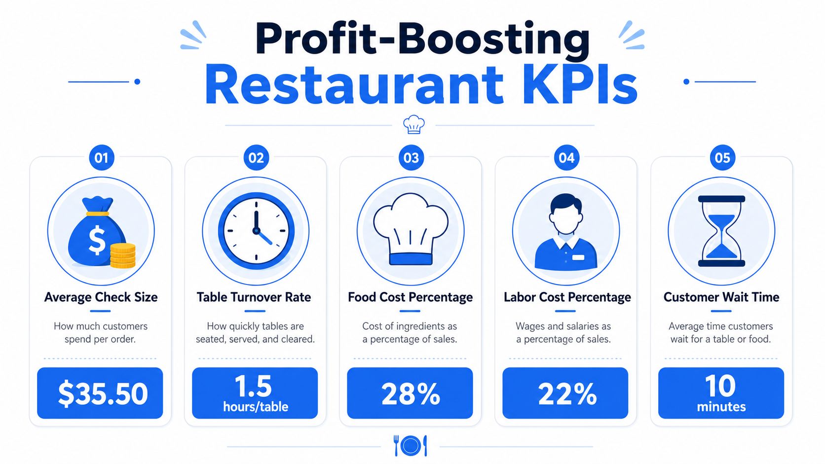
Profit signals worth watching
Start with the measures that tell you whether the menu is producing margin, not just volume.
| KPI | What it tells you | What to do with it |
|---|---|---|
| Average Check Size | Spend per guest | Adjust upsell prompts, bundles, and server focus |
| Average Order Value by channel | Whether dine-in, takeaway, QR, or delivery orders behave differently | Change offers by channel instead of treating all traffic the same |
| Menu Item Profitability | Which dishes actually contribute profit | Reposition, rename, or reduce visibility of weak profit items |
| Total Menu Profitability | How contribution margin and sales volume work together | Promote strong sellers with strong margin, not just popular dishes |
For menu profitability, the formula matters. Menu Item Profitability is calculated as (Number of Items Sold × Menu Price) – (Number of Items Sold × Item Portion Cost). Total Menu Profitability comes from multiplying an item's contribution margin, which is Menu Price – Cost of Goods Sold, by sales volume over a specific period. That's the practical basis for menu engineering, as shown in this menu metrics guide for restaurant operators.
There's also a simple sales view every operator should have in front of them during active trading:
- Top 5 revenue drivers: These are your natural anchors for upsells and bundles.
- Bottom 5 slow movers: These need repositioning, promotion, or removal.
- Average Check Size and AOV by channel: These reveal where digital ordering is helping or hurting spend.
A restaurant sales dashboard should support that work directly. This is why many operators rely on a focused list of restaurant KPI examples that connect to daily decisions.
Operational metrics that change the shift
Margin dies when labor and service slip at the same time.
The most important cost control metric is Prime Cost Percentage, calculated as ((Total Food & Beverage Costs + Total Labor Costs) ÷ Total Revenue) × 100. Operators generally aim to keep it between 55% and 65%, and crossing 65% is a clear sign to audit labor, pricing, or purchasing immediately, based on this restaurant analytics reference on prime cost.
That's not just an accounting number. In a live setting, it tells you whether your current sales level is supporting the labor you've scheduled and the food cost you're carrying.
Watch these alongside it:
- Kitchen ticket time: If this stretches, tables slow and guest satisfaction drops.
- Open or pending orders by station: This shows where the kitchen is stuck.
- Table turnover rate: A slowdown here chokes revenue even if demand exists.
On the floor: When labor is fixed for the shift, the fastest route to protecting margin is usually better throughput and better menu mix.
Guest and menu signals that shape better selling
A useful dashboard also helps the team sell without sounding pushy.
That means tracking:
- Return customers: A simple read on whether the experience is worth repeating.
- Channel behavior: QR menu guests may respond differently to bundles and add-ons than table-service guests.
- Current close rate or occupancy pressure: Helpful for deciding whether to focus on speed or higher check values.
- Top sellers versus top profit items: These are often not the same dish.
Menu psychology becomes practical. If a high-margin item isn't getting selected, the issue may be placement, naming, pairing, or timing. Live analytics helps you spot that while the service period is still running, then adjust your digital ordering flow or QR menu prompts accordingly.
Putting Your Data to Work Practical Scenarios
A dashboard only matters if the manager can do something with it during the shift. The best setups turn live numbers into small, fast decisions. Those small decisions protect revenue.
Scenario one mid-shift slump
It's a weekday dinner. Covers are coming in, but average spend is soft. The room isn't dead, just underperforming.
The manager checks live sales by channel and sees plenty of orders, but not enough add-ons. A dessert bundle or side upgrade is visible in the system, yet uptake is weak. Instead of waiting for tomorrow's report, the team changes the prompt order on the digital menu and makes one high-margin add-on more obvious.
Real-time architecture proves its worth. In a production-grade setup, live hospitality dashboards can ingest more than 1M events per second with sub-second latency using Apache Kafka, Apache Flink, ClickHouse, and Redis, with UI updates occurring within 100–300ms of an event. In the same reference design, when Flink detected a spike in order abandonment over the last five minutes, it pushed a personalized add-on recommendation to the QR menu and lifted average ticket size by 8–12% in test environments where latency stayed under 200ms, as described in this real-time dashboard system design example.
You don't need enterprise scale to use the lesson. The practical point is simple. If the dashboard can spot hesitation early, the menu can respond before the rush is over.
Scenario two kitchen bottleneck
The dining room is seated well, but tables aren't turning. Guests aren't angry yet, though you can feel the drag.
A good dashboard shows real-time kitchen ticket times and table turnover rates, so the manager doesn't have to guess where the slowdown started. If turnover drops by 20%, that's a signal to intervene immediately rather than reading about lost revenue later in a report, based on this restaurant dashboard operations guide.
The manager looks deeper and finds one station stacked with open tickets while another has spare capacity. Staff are reassigned, expo tightens handoff, and the floor slows seating for a short window instead of letting the backlog get worse.
Good live data shortens the distance between noticing a problem and assigning one person to fix it.
A short walkthrough makes the operational side easier to picture:
Scenario three menu engineering quick fix
A new dish should be doing better. It has good margin, strong presentation, and fits the brand. Guests still skip it.
The dashboard shows the item is getting seen but not selected. Meanwhile, lower-value comfort picks keep winning. That usually points to a menu presentation problem, not a product problem.
The fix is operational, not theoretical:
- Move it higher: Put the item where guests naturally pause.
- Pair it smartly: Attach a relevant drink or side that feels easy to add.
- Rewrite the cue: A cleaner description often sells better than a clever one.
- Reduce friction: If digital ordering needs too many taps, guests abandon.
This is why menu analytics should sit close to the ordering experience. The shorter the loop between seeing underperformance and changing the menu, the more money you keep during the same service period.
How to Avoid Common Real-Time Data Traps
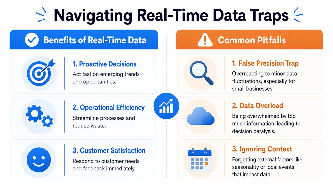
Live data helps when it supports action. It hurts when it tricks the team into reacting to randomness.
That happens a lot in smaller restaurants. A quiet patch on the screen can look urgent when it's really just normal fluctuation.
Small samples create fake urgency
The biggest mistake is the false precision trap. For independent restaurants doing 50–100 daily orders, a 15-minute dip in sales is often normal variance, not a crisis. Guidance on live dashboards warns managers to avoid deploying real-time data without enough statistical rigor, because reacting to random anomalies can do more harm than good, as explained in this analysis of when live dashboards help and when they add noise.
That means you need operating rules, not emotional reactions.
Use something like this:
- Check duration: A short drop may mean nothing. A sustained pattern deserves attention.
- Check context: Weather, a local event, a delivery delay, or a large booking can distort the picture.
- Check multiple signals: Don't act on sales alone. Compare it with covers, ticket times, and order mix.
- Check whether you can act: If there's no practical intervention, don't let the metric hijack the shift.
A dashboard should calm decision-making, not speed up panic.
Monitoring is not the same as analysis
Another common mistake is mixing operational monitoring with deep analysis on one screen.
Monitoring asks, what needs action now? Analysis asks, why has this changed over time? Those are different jobs and should live in different views.
A service dashboard should stay tight. Keep the live screen focused on a handful of current metrics, and show when the data was last updated so the team trusts it. Historical trends, menu redesign work, and broader strategy belong in a separate review workflow.
Here's the simple split:
| Use case | Best view |
|---|---|
| Shift management | Live dashboard |
| Staffing adjustment during service | Live dashboard |
| Promotion rollback during active trading | Live dashboard |
| Quarterly menu redesign | Historical analysis |
| Price architecture review | Historical analysis |
When operators blur those together, they overload the screen and miss the few signals that matter.
Choosing a Dashboard That Works With Your Restaurant
The right dashboard doesn't need a long rollout or a data team standing behind it. It needs to fit the way restaurants already work.
What to look for before you buy
Start with the basics:
- Restaurant-first KPIs: It should focus on sales mix, ticket times, turnover, and menu performance.
- POS compatibility: It should work with your current systems, not force a rip-and-replace project.
- Easy menu and promotion updates: If changes take too long, the data arrives faster than your response.
- Privacy controls: If you're using guest data, consent and GDPR-friendly handling matter.
- Clear live view: Managers should understand the screen in seconds.
If the dashboard is built for generic business reporting, your team will stop using it during service. If it's built around restaurant operations, it becomes part of the shift.
One practical benchmark is whether the system connects performance tracking to actual service decisions. Tools that combine reporting with live restaurant workflows tend to be more useful than standalone reporting layers. A good example is restaurant KPI software for real-time performance, which reflects the kind of operational focus restaurant teams need.
Keep rollout simple
Don't overbuild the first version.
Start with a small live view for one location or one service period. Track a short list of metrics. Give one manager clear rules on what to watch and what actions to take. Once that works, expand.
The goal isn't to create a control tower full of charts. It's to make better calls on pricing, upselling, staffing, and service while guests are still in the building.
If you want a simpler way to turn menu scans into higher check sizes, faster updates, and cleaner real-time visibility, take a look at RevMenue. It's built for restaurants that want live menu intelligence and QR ordering that supports profit, not just prettier reporting.