
Most advice on paper for menus is too simplistic. It treats the choice like a print shop decision when it's really a revenue decision.
That's the mistake.
A menu shapes what guests notice, what they order, how premium your brand feels, and how much friction your team deals with during service. If you pick the wrong paper, the menu looks tired fast. If you pick the wrong format, you also leave money on the table.
Paper isn't dead. In fact, recent data shows 88% of diners prefer paper menus over QR codes when sitting at a restaurant table, which creates a real opportunity to improve the table experience if you execute it well, according to Food Network's coverage of current diner preferences. But preference alone shouldn't decide the whole strategy. Operators still need to choose the format that protects margin, supports upselling, and fits the reality of service.
Table of Contents
- Your Menu Is a Revenue Tool Not Just a List of Food
- Menu Paper Fundamentals That Impact Your Bottom Line
- Comparing Menu Paper Types and Sustainable Options
- Finishes and Lamination When Are They Worth the Cost
- Menu Paper Strategies for Different Venues
- When to Switch From Paper to a Smart QR Menu
Your Menu Is a Revenue Tool Not Just a List of Food
Paper is back for a reason
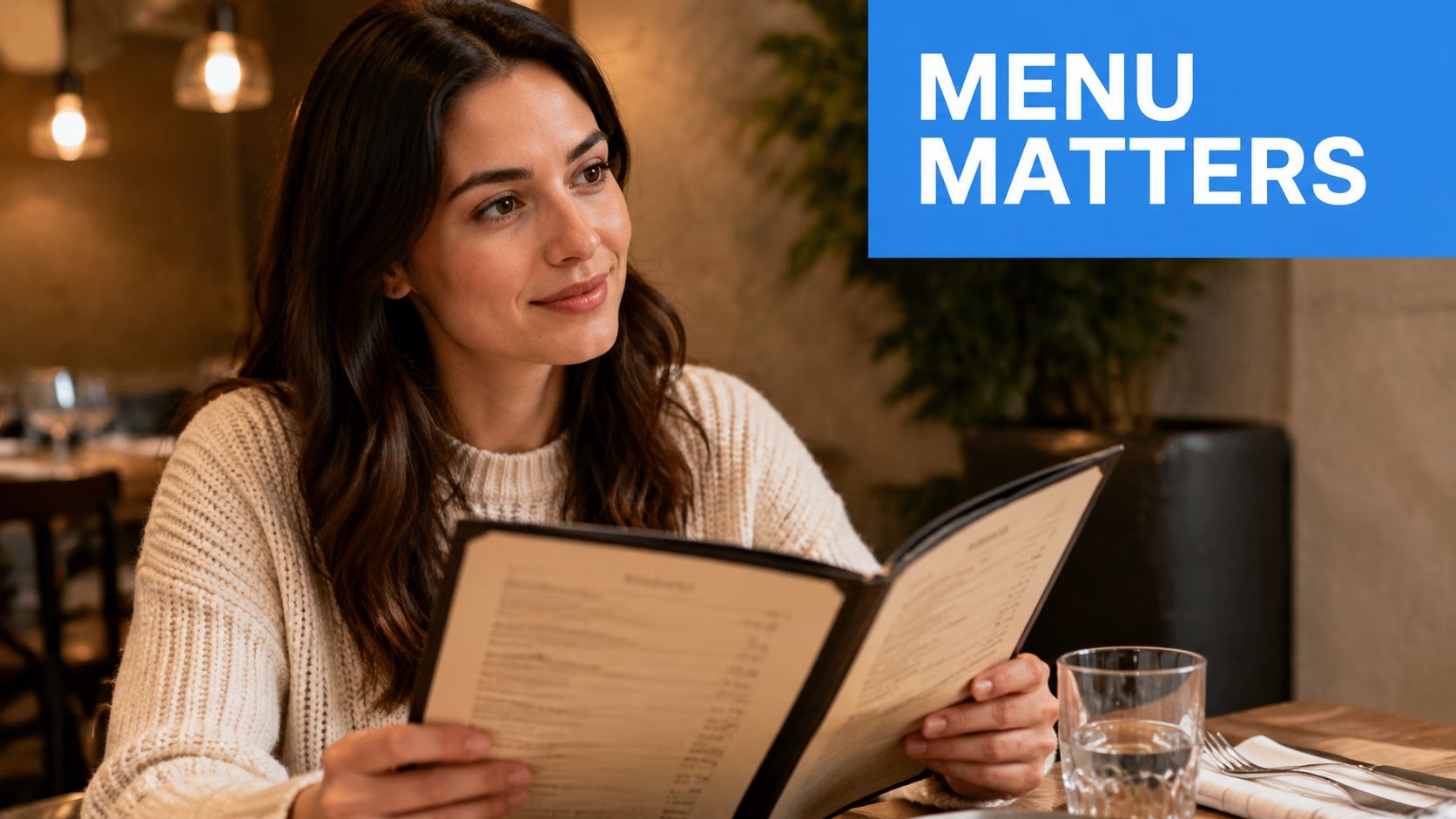
Plenty of operators got pushed toward digital-only menus. That advice was overcorrected. Guests don't sit down dreaming about scanning a code, waiting for signal, zooming around a PDF, and passing a phone across the table.
They want a clean, readable, well-designed menu they can hold.
That doesn't mean every restaurant should go backwards. It means smart operators should stop treating paper as outdated by default. A strong paper menu reduces friction, supports brand perception, and gives guests a calmer ordering experience. That matters in full-service dining, date-night concepts, wine-led venues, and anywhere hospitality is part of the product.
Practical rule: If your concept depends on atmosphere, pacing, and perceived quality, your menu format is part of the experience, not a back-office print choice.
The menu also sits at the intersection of marketing and operations. Guests judge your pricing, quality, and professionalism from that first touchpoint. A flimsy sheet signals compromise. A considered one signals confidence.
Treat the menu like a sales asset
Owners often debate menu paper the wrong way. They ask, “What's cheapest to print?” The better question is, “What helps guests order with confidence and spend well?”
That changes the conversation.
A good menu should do four jobs at once:
- Guide attention: Put profitable items where guests naturally look first.
- Support perception: Match the paper, finish, and layout to your pricing and brand.
- Reduce friction: Make the menu easy to read in low light, at speed, and across age groups.
- Help service: Let staff spend less time explaining and more time hosting.
If you're still treating the menu as a disposable handout, you're underusing one of the strongest levers in the room. This is also why restaurant menu optimization matters operationally and commercially. Layout, wording, grouping, and format all influence what happens at the table.
A paper menu can absolutely be the right choice. But it needs to be chosen with the same discipline you'd apply to labor, pricing, or table turns.
Menu Paper Fundamentals That Impact Your Bottom Line
What GSM actually means in service
Most owners don't need a printing lecture. They need to know what paper survives a Saturday night and still looks good on Monday.
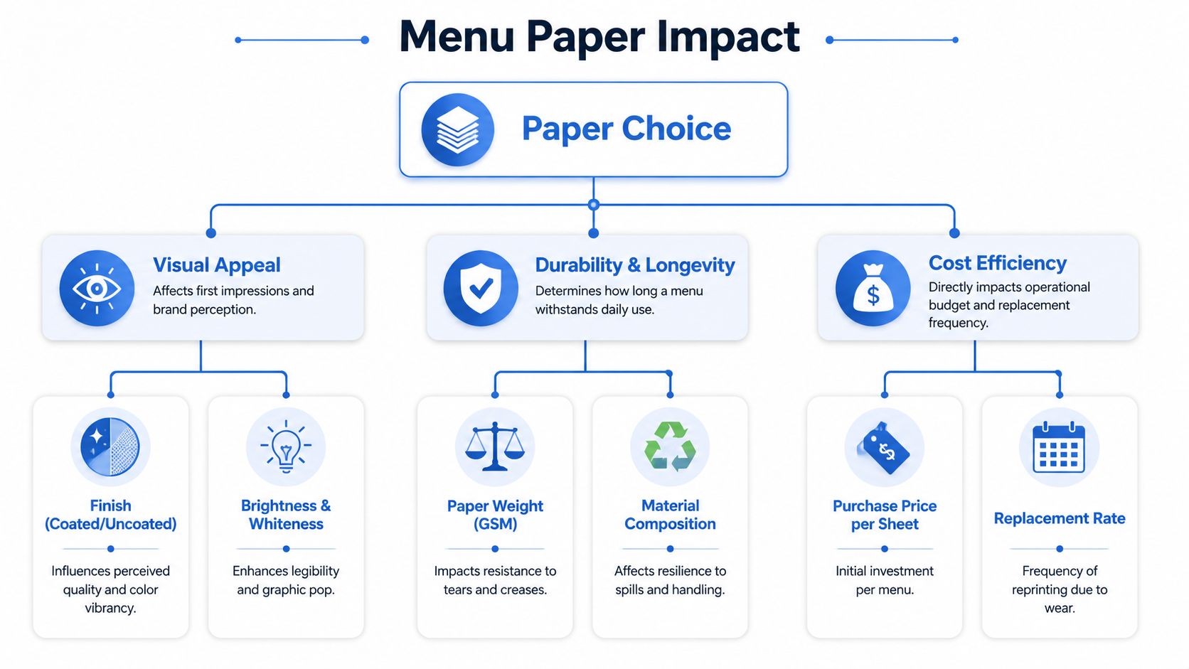
GSM means grams per square meter. In plain terms, it tells you how substantial the paper feels and how well it stands up to handling. Heavier stock usually feels more premium and resists wear better. Lighter stock feels cheaper, bends faster, and looks tired sooner.
That matters because menus get abused. Guests fold them, spill on them, stack plates on them, and drag them across damp tables.
According to The Paperbox's review of menu paper durability, lighter GSM papers degrade 40% faster under repeated handling in high-traffic restaurants than heavier variants. That's not a design detail. It's a replacement problem.
The cheapest sheet often costs more
A lot of restaurants buy low-cost stock because the initial print invoice looks better. Then the menus crease, corners fray, grease marks show, and management reorders earlier than planned.
That's false economy.
Use this practical lens when choosing paper for menus:
- Thin stock: Better for inserts, short-run specials, and one-night events.
- Midweight stock: A workable middle ground for calmer service environments with regular updates.
- Heavy stock: Best when the menu needs to feel premium and survive constant use.
Paper weight also affects guest perception. If you run a chef-led bistro, upscale cocktail bar, or neighborhood Italian with premium pricing, lightweight menus undermine the experience. The guest may not know the paper spec, but they absolutely feel the difference.
A guest won't say, “This menu is low GSM.” They'll think, “This place feels cheaper than the prices suggest.”
Here's the simple decision test:
- Choose heavier stock if your menu stays in circulation and gets handled often.
- Choose lighter stock only if you change it constantly and expect to reprint.
- Prioritize readability over decorative flourishes. Clean contrast wins in actual dining rooms.
- Match the paper to the check average. Premium pricing needs premium tactile cues.
If your team is apologizing for bent menus, replacing marked copies mid-service, or keeping a drawer full of “less damaged” backups, the paper spec is wrong.
Comparing Menu Paper Types and Sustainable Options
How the main paper types perform
There isn't one best material for every concept. There's only the best fit for your service style.
Uncoated paper feels natural and warm. It works well for cafes, bakeries, wine bars, and places where you want a softer, more tactile look. The downside is obvious. It absorbs moisture, marks easily, and won't hold up well around grease or constant wiping.
Coated paper, whether matte or gloss, gives you a cleaner printed look. Colors appear sharper, photos pop more, and wipe-downs are easier than with uncoated stock. Matte usually looks more refined. Gloss usually looks louder. In most restaurants, matte is the safer commercial choice.
Synthetic paper is the workhorse option when durability matters most. It's especially useful for menus that live in messy environments, outdoor sections, bars, poolside settings, and family-heavy concepts.
According to MyBinding's synthetic menu material guide, synthetic paper offers a 95% longer lifespan than laminated paper and reduces menu replacement frequency by 60% annually in grease-intensive environments. If your menus take real abuse, that's hard to ignore.
Menu Paper Comparison
| Paper Type | Feel & Perception | Durability | Cost | Best For |
|---|---|---|---|---|
| Uncoated paper | Soft, natural, artisanal | Lower resistance to spills and repeated handling | Lower upfront | Cafes, bakeries, wine lists, short-lifecycle menus |
| Matte coated paper | Clean, polished, premium without glare | Better day-to-day resilience | Moderate | Full-service restaurants, bistros, modern casual dining |
| Gloss coated paper | Bright, slick, photo-forward | Decent surface protection, but can feel less refined | Moderate | Quick-service, dessert menus, promo-heavy layouts |
| Synthetic paper | Functional, durable, less traditional in feel | Strong against water, tearing, grease, and frequent cleaning | Higher upfront | Bars, outdoor venues, family dining, high-volume operations |
How to think about sustainability without fooling yourself
A lot of menu material decisions get framed as “paper equals sustainable, synthetic equals not.” That's too shallow to be useful.
What matters operationally is the full lifecycle.
If you use cheap paper, replace it constantly, and throw away stacks of damaged menus, that's not a great environmental story. If you use a longer-lasting reusable material that stays in service much longer, the calculation changes. The challenge is that operators often get very little clear guidance on balancing durability with sustainability, which is why this remains a gap in hospitality buying decisions, as noted by Relyco's discussion of menu material questions in food and beverage settings.
Use common sense:
- Short lifecycle menu: Recycled paper can make sense.
- High-abuse environment: A reusable durable substrate may be the smarter choice.
- Brand-led concept: Align the material with what guests expect to touch and see.
- Multi-location operations: Standardize fewer menu formats, not more.
For design work, templates, and layout tooling, these restaurant menu design tools can help operators tighten execution before they spend money on another print run.
Finishes and Lamination When Are They Worth the Cost
When protection pays for itself
Finishes aren't decorative extras. They're either useful or wasteful.
If you run a burger restaurant, sports bar, brunch spot, or family venue, menus get hit with grease, wet hands, syrup, beer, and aggressive cleaning. In those settings, protection is a practical expense. A wipeable finish cuts down on visible wear and keeps menus guest-ready longer.
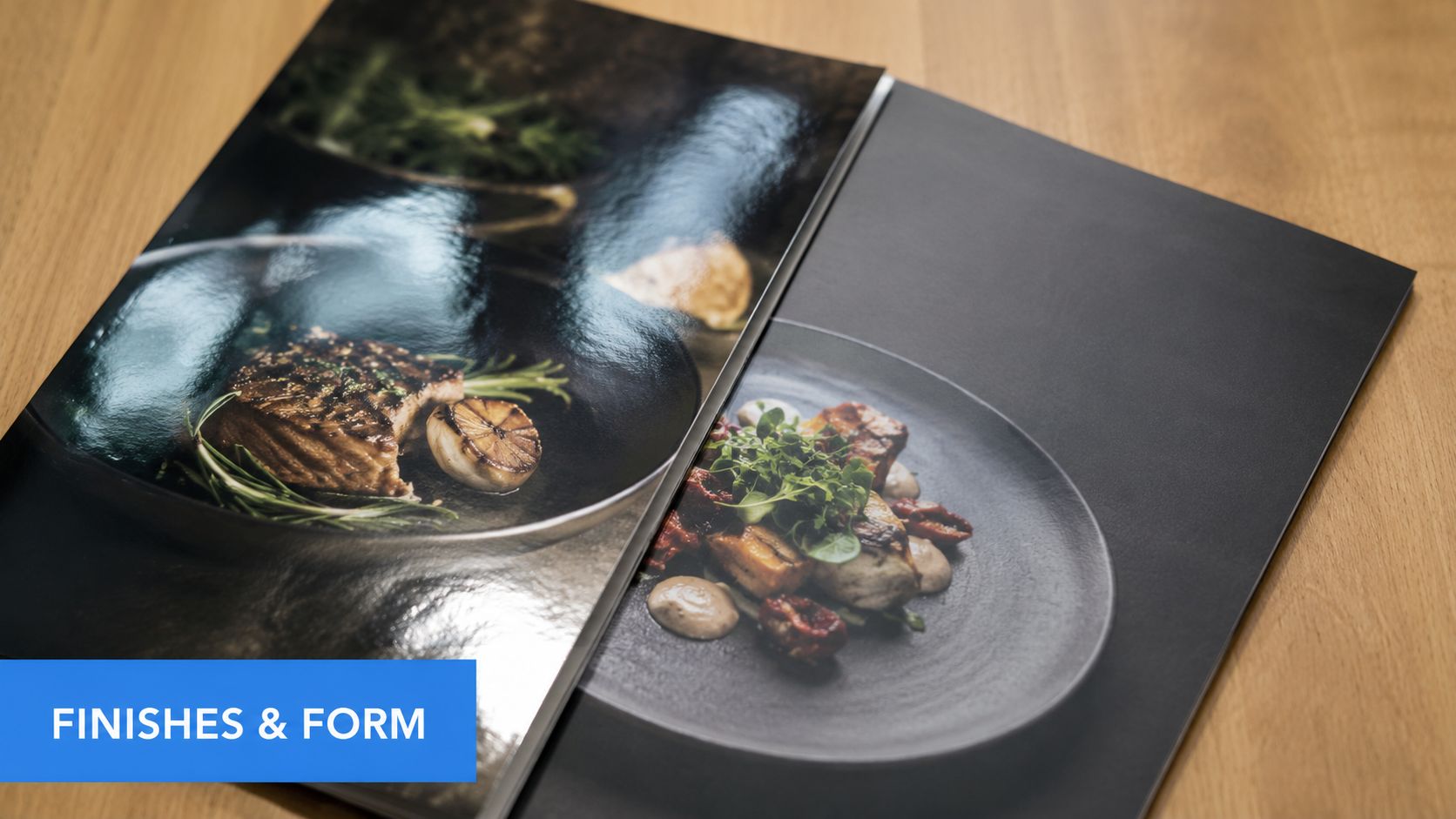
Matte lamination is usually the best all-rounder. It feels better than gloss, reduces glare under overhead lighting, and still gives the menu some protection. Gloss makes colors pop, but it can feel cheap in more premium concepts and can become annoying under bright lights.
If the menu is touched all day and cleaned all night, protection isn't optional. It's part of operating discipline.
When to skip the extra finish
Not every menu needs heavy treatment.
If you update dishes frequently, print seasonal tasting menus, or run a concept where the menu changes with market availability, expensive finishing can be money wasted. A beautifully printed unlaminated card on the right stock can feel more elegant than a heavily protected menu that outlives its content.
Use this filter:
- Lamination makes sense for static menus, high handling, and messy food environments.
- A lighter finish works when appearance matters but the menu still needs some resilience.
- No finish is fine for short-run inserts, chef menus, daily sheets, and wine pairings that change often.
The wrong finish creates two problems at once. You either overpay for durability you don't need, or you underinvest and replace menus far too often.
Menu Paper Strategies for Different Venues
Fine dining and tasting menus
A tasting menu should feel intentional the second it lands on the table. Heavy stock with a refined matte surface usually works best. Keep the design restrained. Let spacing, typography, and paper quality do the work.
Avoid glossy finishes here. They rarely improve perception. They usually make the menu feel more commercial and less considered.
For wine pairings or chef notes, separate inserts can work better than overbuilding one large menu. That gives you flexibility without making the main menu look patched together.
Cafes fast casual and all day concepts
Cafes need menus that survive constant use without looking overdesigned. Midweight coated stock is often the most practical middle ground. It holds up better than a thin artisanal sheet, but it doesn't feel too formal for a coffee-led environment.
For counter-service concepts, think in layers:
- Core menu board or wall menu: Handles the stable offering.
- Printed hand menu: Supports browsing and adds warmth.
- Short-run inserts: Cover seasonal drinks, pastries, or limited items.
This setup keeps print costs under control while preserving some tactile brand value.
Family dining bars and outdoor service
These venues need blunt, practical choices. If the menu lives around kids, shared appetizers, sauces, cocktails, patios, or weather, durability beats delicacy every time.
Use stronger materials and finishes. Menus in these environments are operational equipment.
A few realistic examples:
- Neighborhood diner: Prioritize wipeability, straightforward typography, and stock that won't curl at the edges after heavy handling.
- Sports bar: Use durable material that survives spilled beer, wing sauce, and fast table resets.
- Beer garden: Choose material that resists moisture and doesn't deteriorate when servers move between indoor and outdoor sections.
- Hotel pool bar: Go straight to the most durable option. Wet hands and sun exposure punish ordinary print materials fast.
The right paper should fit the room. A fine dining menu should feel calm and expensive. A family venue menu should survive chaos without looking battered.
If your menu strategy clashes with your service reality, guests notice. So does your labor cost when staff keep replacing, wiping, explaining, and apologizing.
When to Switch From Paper to a Smart QR Menu
Paper is not outdated. Static selling is.
The return of paper menus makes sense. Guests like the tactile experience, and the right stock still signals quality, confidence, and brand discipline. But operators confuse that preference with a reason to keep every menu decision locked in print.
Paper works best when the menu is stable. Once your prices change often, inventory moves daily, or you need tighter control over upsells, paper stops being a sales tool and starts becoming a maintenance problem.
That is the key decision point.
If your team is reciting sold-out items, correcting prices, explaining modifiers, and remembering which add-on to mention at which table, the menu is failing the shift. Servers should close checks, not patch information gaps created by static print.
What a smart QR menu fixes
A good QR menu does not replace a well-designed paper menu by default. It covers the jobs paper cannot handle at service speed.
Use digital when you need to:
- Change prices or item availability instantly
- Promote add-ons, upgrades, and pairings consistently
- Handle location-specific menus without reprinting
- Reduce staff repetition on common questions
- Track guest behavior and menu performance
That is why the best move for many restaurants is not paper or digital. It is paper for brand and comfort, digital for speed, control, and revenue capture.
A weak QR menu is still a bad idea. If it opens a static PDF, loads slowly, or forces guests to pinch and zoom, you have just moved a paper problem onto a phone. A smart system should help you sell, update, and standardize execution across shifts and locations.
Here is the practical rule I give operators:
- Keep paper as the primary format if the menu changes rarely and the in-hand experience is part of the value.
- Improve your paper system if the current menu looks worn, creates confusion, or needs constant reprints.
- Run paper and digital together if you want table presence without giving up fast updates and guided upsells.
- Shift mostly to digital when menu complexity, inventory volatility, or multi-unit consistency starts hurting service and margin.
Keep paper for experience. Add digital when service speed, pricing control, and average check matter more than tradition.
If you are evaluating that move, study a QR code menu for restaurants the same way you would study any other operating tool. It should reduce labor drag, tighten execution, and increase average order value. If it cannot do those three jobs, keep improving your paper menu until your operation gives you a stronger reason to switch.