

Most restaurants hurt their own sales with the same move. They put a PDF on the site, call it a menu, and assume the job is done.
It isn't. Your website menu is part host, part server, part cashier. If it's slow, cramped, confusing, or hard to use on a phone, people don't patiently work through it. They bounce, delay, or order less. For a proper menu for website strategy, the standard is simple: fast to open, easy to scan, built for phones, and connected to ordering.
Table of Contents
- Your Website Menu Is Losing You Money
- Menu Structure and Psychology That Sells
- Copywriting and Photos That Make People Order More
- Optimizing Your Menu for Phones and QR Codes
- Connecting Your Menu to Orders and Analytics
- Your Quick Launch Menu Checklist
Your Website Menu Is Losing You Money
Most owners still treat the website menu like a digital filing cabinet. Upload the print menu, turn it into a PDF, tuck it into the navigation, move on.
That's lazy, and it costs sales.
For retail websites, smartphones already accounted for 63% of all visits as of Q2 2018, and slow-loading websites were tied to $2.6 billion in lost sales each year according to first-impression and mobile usage data compiled by SWEOR. Restaurants don't get a free pass from that reality. If your menu is painful on a phone, you're asking hungry people to work too hard.
A restaurant menu page should answer fast questions fast:
- What do you serve
- What should I order first
- How much is it
- Can I customize it
- How do I order now
If any of that is buried, people leave with uncertainty. Uncertainty kills check size.
Practical rule: If a guest has to pinch, zoom, download, or rotate their screen to read your menu, your menu is underperforming.
This matters even more for operators who rely on takeout, direct orders, and QR scans at the table. Your menu isn't just showing products. It's controlling decision speed, upsell visibility, and how many questions staff have to answer.
A bad menu creates predictable operational drag:
- More staff interruptions: Guests ask basic questions your menu should answer.
- Lower average order value: Add-ons, sides, and premium swaps stay hidden.
- Slower decision-making: Confused diners take longer to order.
- More drop-off: Mobile users quit before they ever reach checkout.
If your current setup is just a print menu shoved online, rebuild it. A proper restaurant website template built around menu performance will do more for revenue than another round of vague brand messaging.
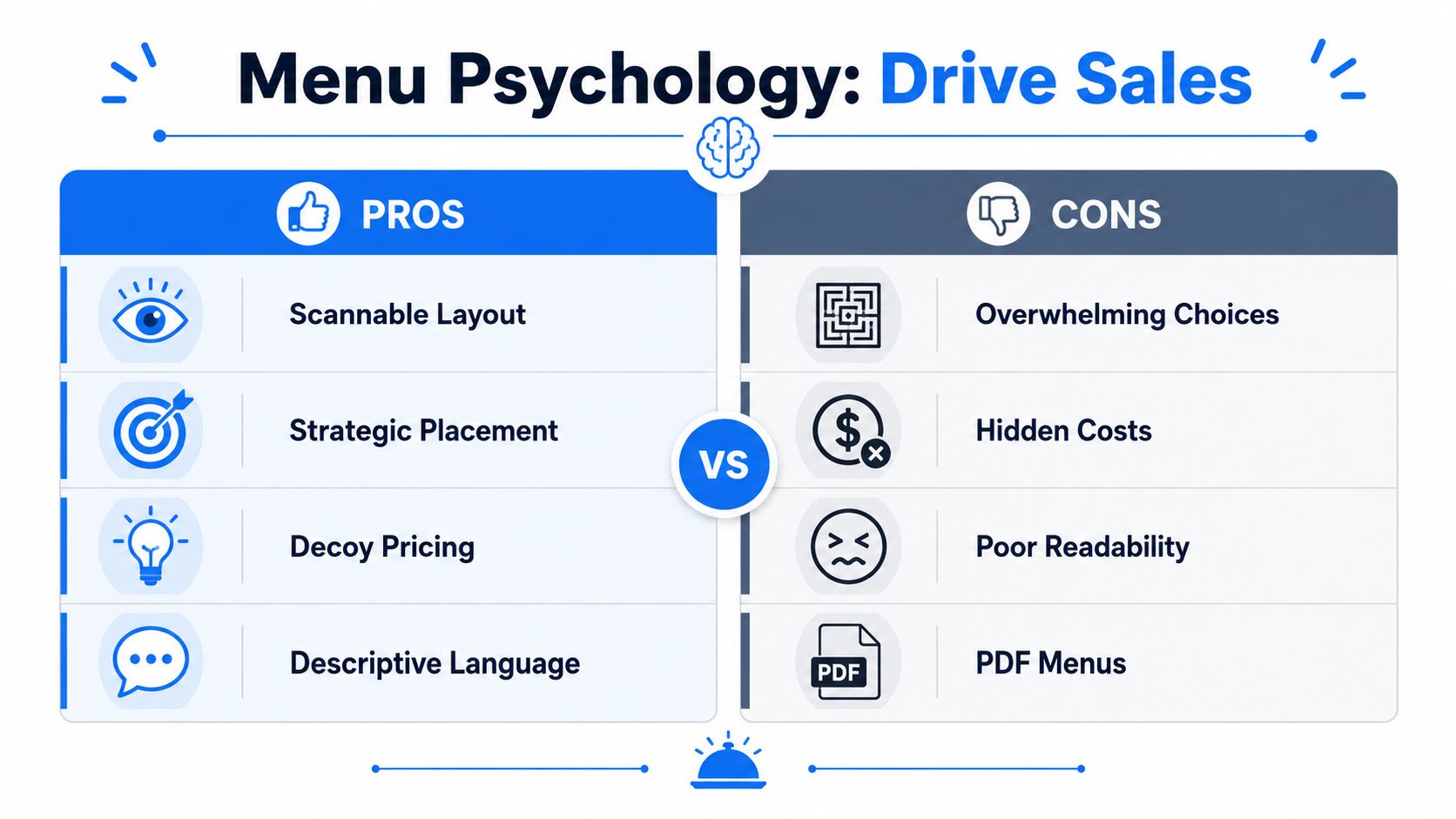
Menu Structure and Psychology That Sells
Restaurants don't need clever menus. They need menus that make choices easy and profitable.
The restaurant industry is too large for menu design to be treated like decoration. In the United States, foods eaten away from home account for one third of caloric intake and almost half of the average household's food budget, and MenuStat has been aggregating nutrition information from restaurant websites since 2012. That tells you something important. Menus are now structured business assets, not static flyers.
Stop listing items like a spreadsheet
A menu for website should never read like an inventory export.
Alphabetical lists are usually a mistake. Long unbroken category pages are also a mistake. People don't scan menus like accountants. They scan for anchors, craveable items, price comfort, and familiar decision paths.
Use a structure that reduces effort:
- Lead with core categories: Starters, mains, drinks, desserts, bundles.
- Keep category names plain: “Burgers” beats “Handheld Creations.”
- Use single-column layouts: They're easier to scan, especially on phones.
- Limit clutter: Every badge, icon, and note competes with selling space.
Build categories around decisions
Think like a customer standing in line or sitting at a table. They're not trying to admire your format. They're trying to decide.
That means category order matters. Put your most commercially important categories where attention is strongest. If combo meals, chef specials, lunch sets, or high-margin signatures drive profit, don't bury them below five screens of filler.
A practical category flow often looks like this:
| Menu goal | Better placement |
|---|---|
| Push signature items | Near the top of the page or category |
| Increase add-ons | Directly under mains or within item flow |
| Sell drinks earlier | Visible before checkout, not only at the end |
| Reduce indecision | Keep similar items grouped and clearly differentiated |
A guest who can compare three strong options will usually order faster than a guest facing twelve barely different ones.
Guide the eye to profitable choices
Here, menu psychology earns its keep.
You should know your stars. Those are the items guests already like and that leave healthy margin. Put them where they're hard to miss. Use subtle emphasis, not circus tricks.
Good moves:
- Short callouts: “House favorite,” “Best seller,” or “Staff pick”
- Selective framing: A box, tint, or spacing treatment around one item
- Better sequencing: Put premium or signature items before weaker sellers
- Description depth: Give your best items more context than your low-priority ones
Bad moves:
- Right-aligned price columns that encourage price shopping first
- Too many featured items so nothing feels featured
- Dense walls of text that hide profitable dishes
- Random item order because “that's how the kitchen thinks about it”
If you only fix one thing, fix visual hierarchy. The eye should land first on what you most want to sell, not what happened to be typed first.
Copywriting and Photos That Make People Order More
Plenty of menus fail even when the layout is decent. The words are flat, the photos are weak, and the food sounds interchangeable.
That's expensive.
Descriptions should sell, not label
“Chicken sandwich” is a label. It doesn't help the guest want it, compare it, or justify the spend.
Write descriptions the way a strong server talks at the table. Specific, appetizing, and short.
Here's the difference:
Weak: Cheeseburger
Better: Signature smash burger with aged cheddar, caramelized onions, pickles, and house sauceWeak: Caesar Salad
Better: Crisp romaine, shaved parmesan, garlic croutons, and a punchy house Caesar dressingWeak: Chocolate Cake
Better: Rich dark chocolate cake with a soft center and whipped cream
What works in restaurant copy:
- Lead with the main draw: crispy, slow-roasted, charred, house-made, buttermilk-brined
- Name the premium cues: brioche, aged cheddar, miso butter, rosemary fries
- Keep it concise: enough detail to build appetite, not a life story
- Differentiate similar dishes: tell guests why this burger is not that burger
One more rule. Don't let every item have the same energy. Your most profitable dishes deserve the strongest language.
Your menu copy should answer the silent question every guest asks: “Why should I order this one?”
Use fewer photos and make them better
Owners often go the wrong way here. They upload lots of mediocre pictures because more feels safer.
It isn't safer. It lowers trust.
A few strong photos outperform a gallery of dark, inconsistent, phone-shot images. If you can only afford a small shoot, start with your signatures, your highest-margin drinks, and one dessert that reliably closes the meal.
Use photos when they do one of three jobs:
- Introduce unfamiliar items
- Support premium pricing
- Trigger impulse add-ons
Skip photos when they make the menu look cheap or inconsistent.
A practical standard for food images:
| Good photo choice | Bad photo choice |
|---|---|
| Natural-looking lighting | Harsh flash |
| Clean plate framing | Busy table clutter |
| One clear hero item | Five dishes fighting for attention |
| Consistent style across categories | Random mix of sizes and tones |
If you run a café, use photos for pastries, seasonal drinks, and bundled breakfast sets. If you run full service, prioritize signatures and profitable add-ons. If you run quick service, show the final built item, not a sad overhead shot that undersells portion and texture.
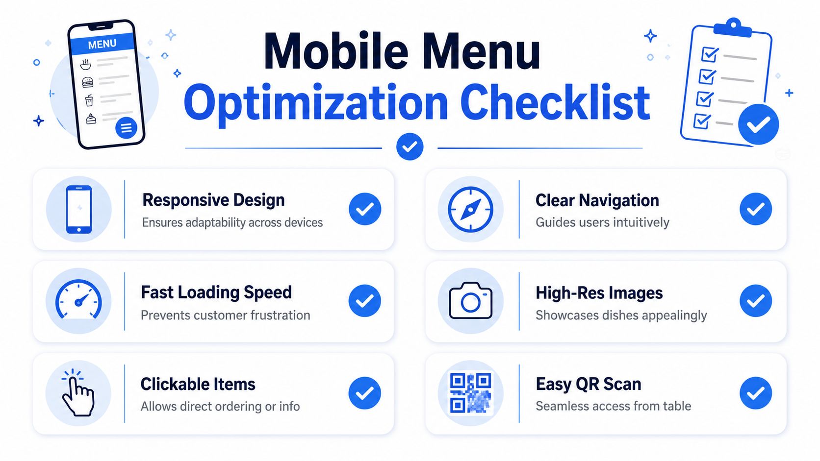
Optimizing Your Menu for Phones and QR Codes
Most digital menu problems are mobile problems. That's where restaurants lose the easiest wins.
A mobile-first menu is not optional. Smartphones accounted for 63% of all retail website visits as of Q2 2018, and slow-loading sites were associated with $2.6 billion in lost sales annually according to mobile-first website findings from SWEOR. For restaurants, that means your menu has to open quickly, read cleanly, and feel effortless on a small screen.
PDF is the wrong format for a phone
A PDF menu usually creates friction in all the places that matter.
It loads slowly. Text appears tiny. Guests zoom in, lose their place, and bounce between sections. On a weak connection, it gets worse. At the table, that friction turns into more staff questions. Off-premise, it turns into abandoned intent.
Use a responsive web menu instead. That means:
- Text resizes to the device
- Categories stack cleanly
- Buttons are easy to tap
- Items can link directly to ordering or details
- Changes go live instantly without re-exporting a file
Here's the standard I recommend for mobile layout:
- Single-column menu pages
- Large tap targets
- Clear category jumps
- Visible modifiers and add-ons
- No forced app download
- No account required just to read the menu
What a good QR menu actually does
A QR code should shorten the path to ordering, not add another layer of annoyance.
When QR works, guests scan, browse, decide, and move forward without asking for help. When it fails, they're stuck with tiny text, awkward page jumps, or an interface that feels built for desktops.
This video shows the kind of mobile-first thinking restaurant operators should care about:
Fix the table-side journey
A strong QR menu improves both guest experience and floor operations.
Use this checklist when testing your own setup:
- Scan speed: The code should open instantly from an average phone camera.
- Landing page clarity: The first screen should show food categories right away.
- Table readability: Guests should read item names without zooming.
- Ordering path: If ordering is enabled, the path should be obvious and short.
- Service backup: Staff should still be able to guide guests quickly if needed.
If your QR code opens a PDF, a cluttered homepage, or a generic link hub, fix that first.
Good QR menus reduce repeated questions, shorten dead time between seating and ordering, and make upsells visible without asking staff to memorize scripts.
Connecting Your Menu to Orders and Analytics
A menu page that doesn't connect to action is wasted traffic.
If people can browse but can't move naturally into ordering, booking, or the next decision, your site is leaking intent. A proper menu for website setup should connect menu views to outcomes.
A menu should lead somewhere
At minimum, every item or category should support the next step. That might mean direct online ordering, location-specific availability, modifier choices, or links into your existing system.
The usability side matters here. Nielsen Norman Group recommends click-activated submenus instead of hover and advises against complex cascading menus. It also says links should be clearly labeled, large enough to tap, and include signals like caret icons when more options exist, as explained in Nielsen Norman Group's menu design guidance.
That applies directly to restaurant ordering paths.
Use navigation that helps guests move without hesitation:
- Click-based category reveals
- Clear item labels
- Simple submenu depth
- Visible “Order now” or equivalent actions
- No tricky desktop-only interactions
For operators who want better decision-making, restaurant data analytics tools turn menu performance into something you can use.
Questions your menu data should answer
Static menus tell you nothing. Connected menus tell you where money is being left behind.
You should be able to ask practical questions like:
- Which item gets attention but not orders
- Which starter pairs naturally with high-value mains
- Which dessert is rarely seen because it sits too low on the page
- Which modifier creates friction
- Which category performs differently by location
That information helps you make smarter changes:
| If you notice | Likely action |
|---|---|
| High views, low orders | Rework price, photo, or description |
| Strong mains, weak add-ons | Surface pairings earlier |
| Guests stall in deep navigation | Simplify categories |
| Staff still answer repeat questions | Add clearer item details |
Don't settle for “the menu is live.” That's the bare minimum. The useful question is whether the menu is teaching you how guests buy.
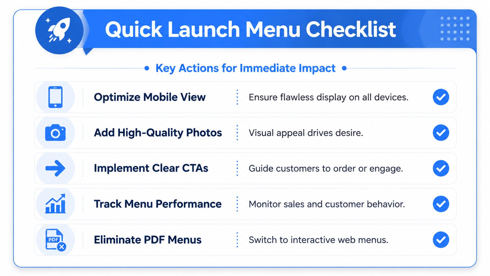
Your Quick Launch Menu Checklist
Most restaurants don't need a full rebuild to improve results. They need a sharper first version.
The fastest win is to stop treating the menu like a document and start treating it like a selling tool. That means mobile-first layout, stronger item naming, cleaner category structure, and a direct path to action.
Do this today
Run this audit in one sitting:
- Open your current menu on your own phone: If it's annoying for you, it's annoying for guests.
- Remove the PDF from the primary path: Replace it with a web page version.
- Cut category clutter: Merge overlapping sections and rename anything vague.
- Rewrite your top-selling item: Add sensory detail, ingredients, and one point of difference.
- Feature one profitable dish per category: Don't feature five.
- Check every price line: Make sure pricing is easy to read but not the only thing that stands out.
Do this next week
Once the basics are fixed, tighten the revenue side.
- Test your QR code in the dining room: Different tables, different light, different phones.
- Add a small set of quality photos: Signatures first, then profitable add-ons.
- Build simple pairings into the menu flow: fries with burgers, pastry with coffee, dessert after mains.
- Review dead spots: Look for items nobody notices because placement is poor.
- Clean up navigation labels: If a first-time guest wouldn't understand it instantly, rename it.
A menu doesn't need to be fancy. It needs to be easy, persuasive, and operationally useful.
If you're short on time, focus on three things first: ditch the PDF, fix the phone experience, and rewrite the descriptions on the items you most want to sell. That alone will put you ahead of a lot of restaurants.
If you want a faster way to turn scans into orders, upsells, and usable menu data, RevMenue is built for exactly that. It gives restaurants a fast-loading QR and web menu system, simple updates across locations, and revenue-focused tools that help teams sell smarter without adding friction for guests or staff.