

Most restaurants don't have a website problem. They have an order-loss problem.
A guest taps your site from Google on their phone, wants your menu in seconds, can't find the right page, pinches around a PDF, misses the order button, and leaves. Your dining room never knows that sale existed. Your staff still answers the same calls about hours, address, and whether you take reservations.
That's why picking a Restaurant Site Template isn't a branding exercise. It's an operations decision. The right template reduces friction, pushes guests toward higher-value actions, and takes repetitive questions off your team. The wrong one looks polished and still underperforms. If you're already working on restaurant menu optimization for better margins, your website has to support that work instead of undoing it.
Table of Contents
- Your Website Is Leaking Revenue So Fix It
- What Makes a Template Profitable Not Just Pretty
- The Modern Restaurant Template Checklist
- Customizing and Launching Your New Site
- Common Template Traps and How to Avoid Them
- Turn Your Website Into a Growth Engine
Your Website Is Leaking Revenue So Fix It
A bad restaurant website doesn't fail dramatically. Its failure is subtle.
It hides your menu behind extra clicks. It sends mobile visitors to cramped layouts. It makes guests hunt for hours, location, and reservation options. Every bit of friction pushes people back to Google, to a delivery marketplace, or to the restaurant down the street with a simpler site.
That matters because your website now sits in the middle of discovery, menu browsing, ordering, and repeat business. It's not a digital flyer anymore. It's your front counter for people who haven't walked in yet.
The real cost of a weak template
If your template wasn't built for restaurant behavior, you'll feel it in daily operations:
- More staff interruptions: Team members answer basic phone calls that the site should handle.
- More abandoned orders: Guests drop off before they reach checkout or booking.
- More menu confusion: People can't tell what's available, what's popular, or what to add.
- More inconsistency: Your website menu, QR menu, and in-store menu drift apart.
Practical rule: If a first-time guest can't find your menu, order button, hours, and location in a few seconds on mobile, the site is costing you money.
Treat the site like service infrastructure
Operators often overspend on visual polish and underspend on usability. That's backwards.
A profitable restaurant site template should do three things well. It should help guests decide fast, act fast, and come back. That means menu-first layout, obvious calls to action, and mobile behavior that feels effortless during lunch rush, commute browsing, or late-night ordering.
Pretty matters. But pretty without conversion is decoration.
What Makes a Template Profitable Not Just Pretty
A strong Restaurant Site Template acts like a sales system. It guides guests from interest to action without forcing them to think too much.
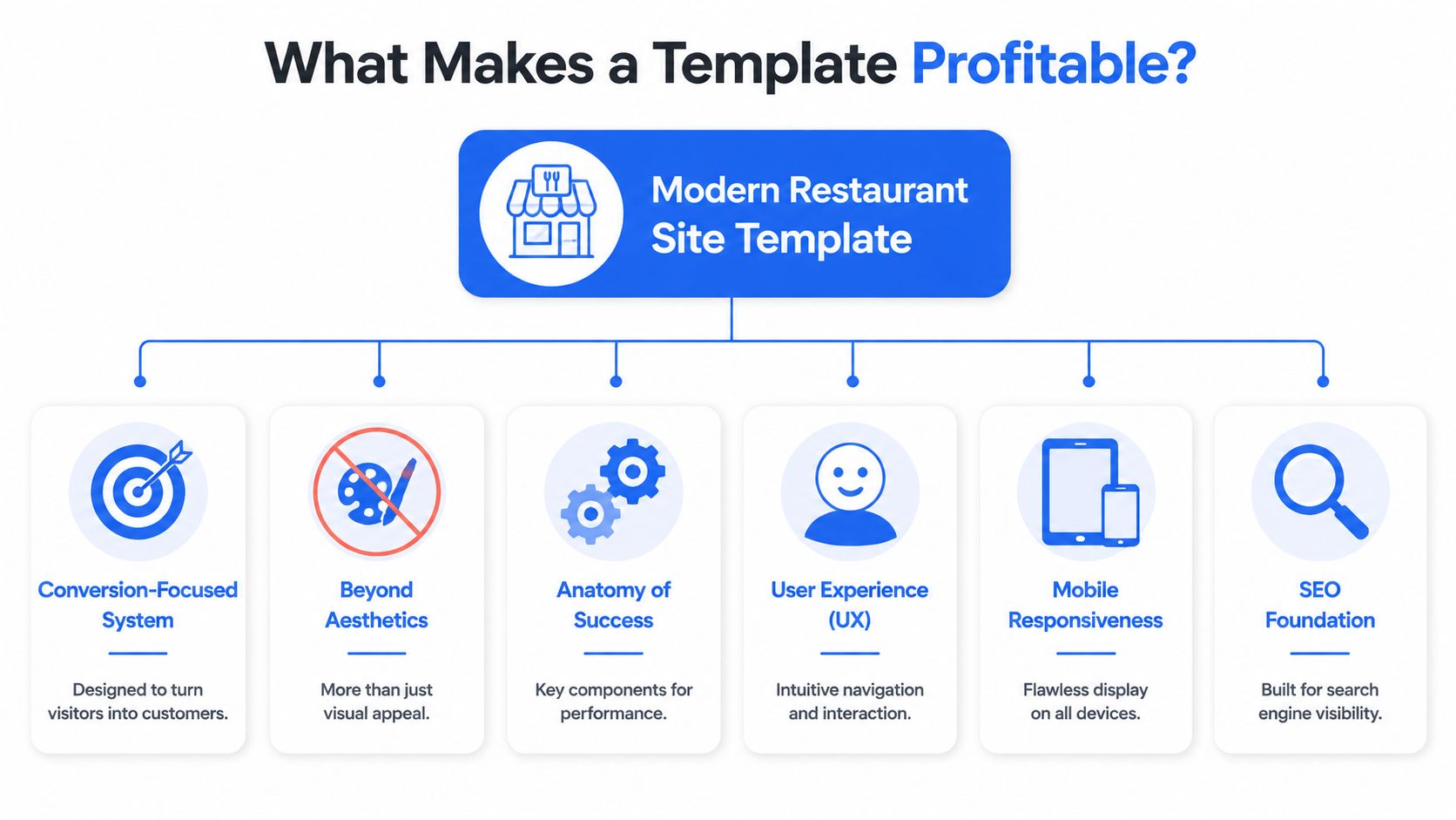
The template has one job
Most owners judge templates by homepage beauty. I judge them by what happens next.
Can a guest move from Google to menu to order without friction? Can someone booking dinner find the reservation path instantly? Can a busy parent checking your site on a phone understand your menu categories and make a decision fast?
If the answer is no, the template isn't doing its job.
What guests actually want to do
Guest behavior is clear. 91% of guests check a restaurant's website before ordering, 75% want to browse a menu, 64% want online ordering, 61% say menu-item photos are one of the most important website features, 66% prefer finding new restaurants through Google, and 87% are more likely to reorder when a restaurant provides a great online experience, according to Owner's restaurant website design data.
Those numbers tell you exactly how to evaluate a template.
| Template element | Why it matters operationally |
|---|---|
| Fast menu access | Guests came for food information first, not your origin story |
| Clear menu hierarchy | Better scanning means fewer drop-offs and fewer confused calls |
| Visible order and booking buttons | Directs high-intent visitors to revenue actions |
| Photo-ready layout | Supports menu-item presentation where visuals influence decisions |
| Search-friendly page structure | Helps more first-time guests find you through Google |
A lot of templates bury the money pages under branding blocks, sliders, and oversized hero images. Skip that. Restaurants need speed to decision.
Design choices that affect revenue
A photo-heavy menu isn't just a design trend. It supports ordering behavior. A clean category structure also helps you guide guests toward high-margin areas like combos, add-ons, desserts, and drinks.
Use your homepage to route traffic, not trap it. Good templates make these paths obvious:
- Order now
- Reserve a table
- View menu
- Find location
- See hours
Guests don't reward clever navigation. They reward easy decisions.
If a template makes those actions feel immediate, it's profitable. If it makes them feel hidden, it's expensive no matter how cheap it was.
The Modern Restaurant Template Checklist
Friday night. A guest is standing outside your restaurant, phone in hand, trying to check the menu, book a table, or place an order before choosing your competitor instead. Your template either helps that guest act fast, or it slows them down and costs you the sale.
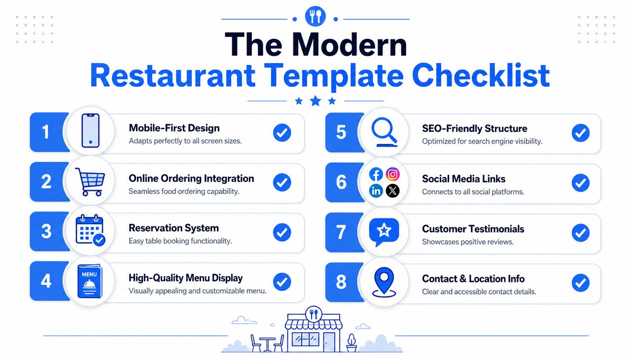
Treat this checklist like an operations filter, not a design wishlist. A profitable restaurant template reduces friction, cuts avoidable staff questions, and pushes more guests into ordering, booking, and repeat visits.
Use this checklist before you buy
Mobile-first behavior: A template should feel built for a phone from the start. Buttons need to be thumb-friendly, text needs to stay readable, and key actions need to appear early. Google uses mobile-first indexing, so weak mobile structure hurts both usability and visibility.
Menu showcase that isn't a dead PDF: Your menu should load fast, be easy to scan, and let guests jump between categories without pinching and zooming. Separate breakfast, lunch, dinner, drinks, kids, and specials in the same way guests search for them. If you also use in-house digital menus, a QR code menu setup for restaurants should connect cleanly with the same category logic.
Reservation flow: Booking should happen in a few taps with no confusion about party size, date, or time. If the template forces guests through clunky redirects, expect more drop-off and more phone interruptions for your host stand.
Online ordering path: Pickup and delivery buttons should be visible immediately on mobile. Guests with buying intent should never have to open a menu, scroll back up, and hunt for the order link.
Event section: Private dining, happy hour, tastings, live music, and seasonal promos need their own space if they drive revenue for your concept. A good template makes these offers easy to update without rebuilding the page.
Location, hours, and contact details: Put them where tired, distracted, hungry people can find them fast. Hidden hours create unnecessary calls. Unclear address details cost you foot traffic.
Here's a quick visual walkthrough worth watching before you compare options:
A quick test for operators
Open the template demo on your phone. Give yourself 60 seconds.
- Can you reach the menu immediately
- Can you tell how to order or book
- Can you find hours and address without scrolling forever
- Can you understand the menu categories at a glance
- Can you picture a distracted guest using it while commuting, waiting in line, or making a fast lunch decision
Webflow's restaurant template catalog highlights menu showcases, reservation systems, and event sections as common built-in modules in Webflow restaurant website templates. That matters because those modules support self-service instead of pushing routine questions back onto your staff.
Operator test: If your team has to explain the site to a guest on the phone, the template failed.
The right template does more than present your brand well. It shortens decision time, protects staff bandwidth, and gives regulars a faster path back to your menu.
Customizing and Launching Your New Site
Buying the template is the easy part. Launch discipline is what separates a clean digital storefront from a messy one.
Build the menu first not the homepage
A common starting point involves colors, fonts, and hero banners. Start with the menu.
Your menu structure controls how guests browse, how easily they add items, and how often they ask staff for clarification. Group categories the way real guests think. Keep names clear. Use descriptions that answer purchase questions fast. Add strong food photography where it helps the guest choose, not just where it fills space.
A solid launch order looks like this:
- Set category logic: mains, starters, lunch deals, desserts, drinks, kids, and seasonal offers should be cleanly separated.
- Write concise item descriptions: focus on what helps the guest decide quickly.
- Place profitable add-ons naturally: sauces, sides, upgrades, pairings, and bundles should sit near the item they support.
- Keep pricing and availability current: outdated menu details create mistrust fast.
Launch with clean operations
The template also needs the right technical base. A high-performing restaurant site template should use a responsive HTML5/CSS3 front end with mobile-first optimization, and template catalogs also prioritize customization, SEO-friendly structure, and mobile optimization in this category, according to Esplanda's restaurant website template guide.
That technical foundation matters because your site isn't working alone. It needs to fit your existing workflow.
Use this rollout table to keep the launch practical:
| Launch task | Why it matters |
|---|---|
| Sync menus across channels | Prevents website, in-store, and QR versions from conflicting |
| Connect ordering and payment tools | Removes handoffs that create abandoned carts |
| Set role ownership | Someone must own menu updates, promos, and hours |
| Test on real phones | Desktop previews miss mobile friction |
| Check every CTA | Order, reserve, call, map, and menu links must all work |
If you use a QR menu in-store, connect that experience to the website menu so guests don't see different pricing, item names, or availability. A tool like RevMenue's QR code menu for restaurants can sit alongside your existing systems to keep digital menus updated across touchpoints without forcing staff to maintain separate versions manually.
Launch day advice. Test the site like a rushed customer, not like the person who built it.
That means one hand, low attention, average signal, and zero patience.
Common Template Traps and How to Avoid Them
Friday night. A customer taps your site from Google, wants to order in under a minute, and hits a slow homepage, a PDF menu, and a buried order button. You did not lose that sale because of demand. You lost it because the template got in the way.
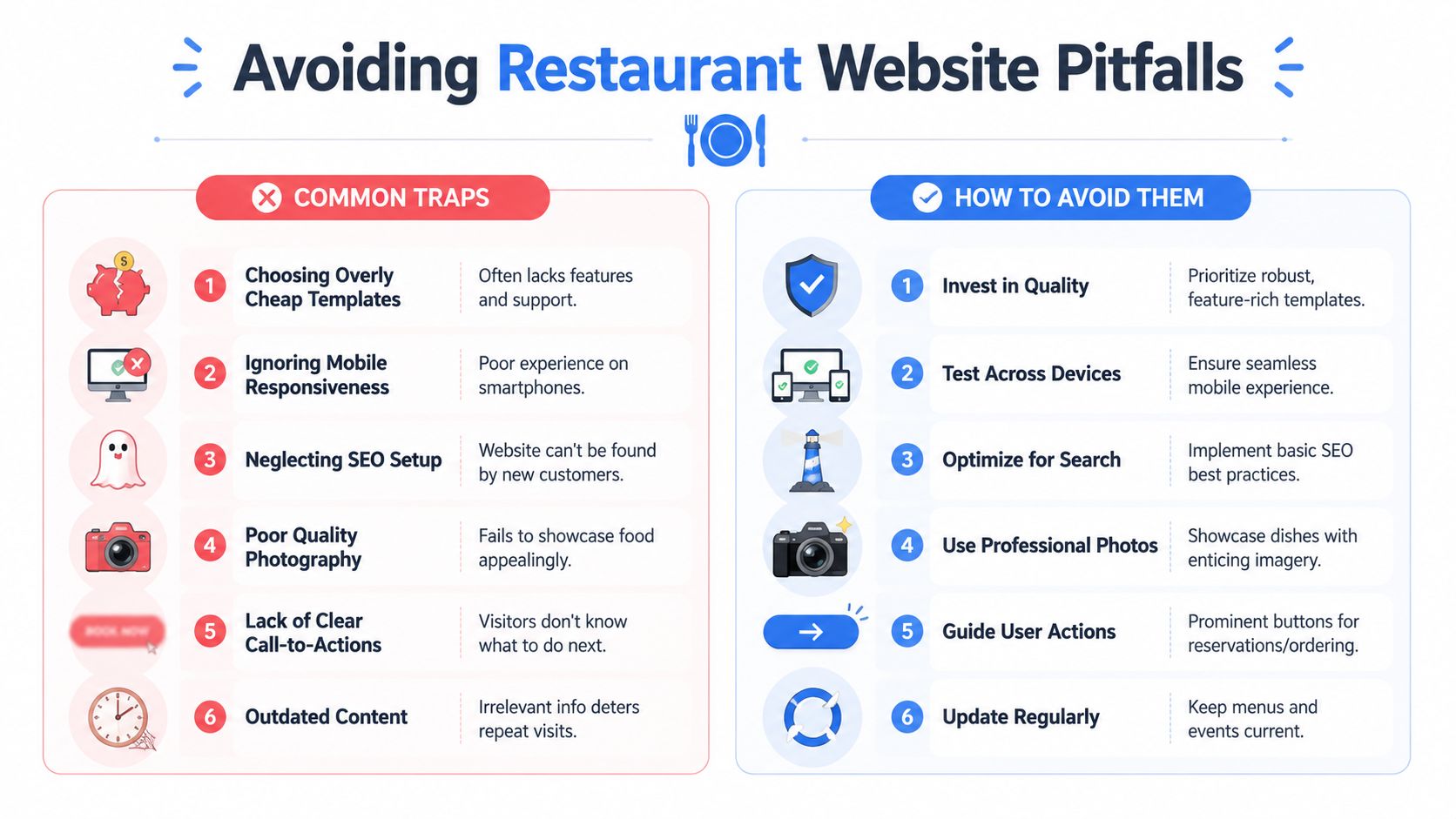
A weak template hurts more than appearance. It creates extra calls about hours, forces staff to answer questions the site should handle, and sends high-intent guests back to delivery apps where your margins are worse. Good operators catch these problems early.
The traps that cost restaurants money
The first trap is buying a template like a brand exercise. Operators should buy it like a front-of-house system. If the path to order, reserve, call, or find the menu is not obvious in the first screen, the template is failing at its job.
The second trap is hiding operational information behind design choices. Guests do not want to hunt for hours, parking, location, happy hour timing, or private dining details. They want answers fast.
The third trap is publishing menu content in formats that search engines and customers both hate. A PDF can look tidy to the owner and still create friction for everyone else.
Watch for these common failures:
- Order and reservation buttons that blend into the design
- Homepage sliders that push key actions below the fold
- Menu PDFs instead of text-based menu pages
- Missing modifiers, prices, or availability notes
- Old event banners and expired promotions
- Templates stuffed with animations, pop-ups, and heavy media
- No clear path for catering, private events, or large-party inquiries
What to do instead
Treat every page like it has one job. The homepage should route people. The menu page should help them decide. The contact page should answer location and service questions without forcing a phone call.
Use this standard:
| Trap | Better choice |
|---|---|
| Choosing the best-looking demo | Choose the template with the shortest path to order, reserve, and call |
| Using one all-purpose homepage | Create clear routes for dine-in, takeout, delivery, catering, and events |
| Uploading a static menu file | Build menu sections as editable page content your team can update fast |
| Letting promotions pile up | Remove expired offers weekly and keep current offers near the top |
| Guessing what guests want | Review restaurant data analytics that show where guests click, drop off, and convert |
One more trap gets ignored. Templates often look clean in preview mode and break down once real restaurant content gets added. Long item names, modifier groups, allergy notes, multiple service types, and location-specific hours expose weak layouts fast. Test the template with your actual menu and actual workflows before you commit.
Boring wins here. Clear buttons. Fast pages. Readable menus. Accurate hours. Current photos. A template that does those jobs will produce more orders and fewer operational headaches.
Turn Your Website Into a Growth Engine
A restaurant website should do more than exist. It should reduce friction, support the menu, and move guests toward profitable actions.
The right Restaurant Site Template gives you the base layer. It handles discovery, menu browsing, reservations, ordering paths, and everyday service information. But the key benefit comes when that site connects to the rest of your digital operation. Your QR menus, upsell opportunities, item performance, and repeat-guest behavior should all reinforce the same guest journey.
The operators who win online don't treat the website like a one-time project. They treat it like a working sales channel. They update menus fast, keep calls to action obvious, and use real behavior to improve what guests see first.
If your site foundation is in place, the next step is using restaurant data analytics that show what guests actually order and when so your menu, promotions, and digital touchpoints stay aligned with how people buy.
Once your website stops leaking intent, you can focus on increasing order value and reducing friction across the full guest journey. RevMenue is one option for operators who want QR menus, digital upsells, menu management, and analytics to work alongside their current website, POS, and payment setup.