
A QR code menu for restaurants is not a tech accessory. It is a sales and operations tool that either raises revenue or drags service down.
I see the same mistake in restaurants of every size. They replace printed menus with a QR code that opens a static PDF, then assume the job is done. Guests pinch and scroll through tiny text, servers step in to answer basic questions, and the menu does nothing to steer choices, surface add-ons, or reflect real-time availability. The code saves printing costs, but it does not improve the business.
A strong QR menu does more than display items. It helps guests choose faster, highlights profitable dishes, keeps updates accurate, and removes friction between the table, the floor, and the kitchen. That matters during a busy lunch rush, when every extra minute at the table affects turn times, labor pressure, and check average.
The question is not how to generate a code. It is how to make each scan produce more revenue and less operational waste.
That is the standard this guide uses. The focus is not setup basics. The focus is how to turn a QR menu from a digital copy of your print menu into a tool that sells better, runs cleaner, and gives you better decisions from actual guest behavior.
Table of Contents
- Your QR Menu Is Costing You Money
- Build a Smarter Menu Foundation
- Design a Menu That Sells for You
- Drive Higher Checks with Smart Upselling
- Streamline Operations and Support Your Team
- Use Data to Make Smarter Decisions
Your QR Menu Is Costing You Money
A QR menu that only opens a PDF is not a digital upgrade. It is a service bottleneck with a cleaner surface.
I see this in restaurants that believe the job is done once the code scans. Guests can read the menu, so the system looks functional. From an operations and revenue standpoint, it is underperforming.
A static PDF cannot react during service. It cannot remove a sold-out item before a server has to apologize for it. It cannot surface a profitable side when a guest is already looking at a burger. It cannot show which categories get attention and which ones get skipped. It takes the limits of a printed menu and compresses them onto a phone screen.
Practical rule: If your QR menu behaves like a photographed print menu, it's a digital wrapper around an old problem.
The cost usually shows up in three areas:
- Lost upsells: Guests browse, but the menu does nothing to encourage add-ons, upgrades, or pairings.
- Service drag: Staff still spend time answering preventable questions about ingredients, modifiers, and item availability.
- Guest friction: Pinching, zooming, and scrolling through a clumsy file slows decisions and makes ordering feel harder than it should.
That friction has a real operating cost. A table that needs extra clarification ties up staff. A guest who cannot quickly find the lunch combo or happy hour section is less likely to order it. A server who has to keep explaining what is 86'd is not selling dessert.
The bigger miss is strategic. Your QR code menu for restaurants reaches guests at the exact moment they are deciding what to buy. Few tools sit closer to the purchase than that. Treating it like a basic utility wastes a channel that can increase check average, reduce avoidable questions, and make the floor run cleaner.
QR menus are mainstream enough that weak execution stands out. The issue is no longer whether a restaurant should offer one. The issue is whether that menu helps the business sell and operate better, while still giving guests who prefer human service an easy path to order.
That is the standard worth aiming for.
Build a Smarter Menu Foundation
A profitable QR menu starts with one decision. Don't build it like a file. Build it like a living service tool.
Stop linking to a PDF
The technical split that matters most is static QR code versus dynamic QR code.
A static code points to fixed content. If the destination changes, you often end up reprinting materials or patching around limitations. A dynamic code points to a flexible destination you can update from a dashboard. That's what lets operators change pricing, remove sold-out dishes, rotate specials, and test promotions without creating a new print cycle.
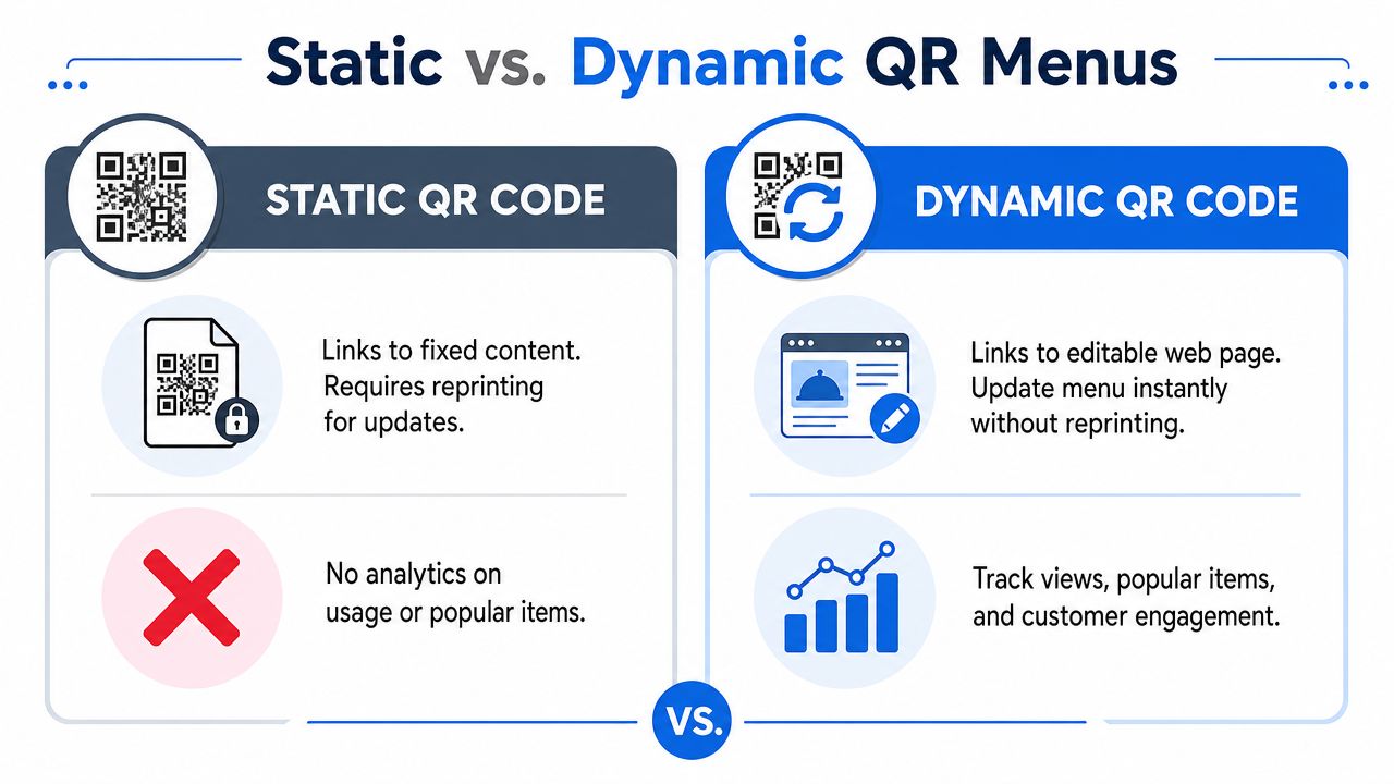
A technically advanced setup should use a dynamic QR code because it supports real-time updates, analytics, and menu customization from a dashboard, as outlined in Deliverect's guide to QR menus and self-serve systems.
What the setup should look like
The rollout itself is straightforward. The value comes from choosing the right structure before you print anything.
Create a mobile-first menu URL
This should open cleanly on a phone, not force guests into zooming around a desktop layout.Generate a dynamic QR code
The code stays the same while the destination content stays editable.Place it where decisions happen
Tables, counters, windows, and receipts all have a role, but dine-in placement should remove any doubt about where to scan.Manage from one dashboard
The team should be able to update items, prices, allergens, availability, and promotions quickly.Review scan and menu behavior
If one placement underperforms or one category gets ignored, fix it fast.
A strong platform should make those tasks routine, not technical. Operators shouldn't need a designer every time they change lunch pricing or add a weekend cocktail.
Here's the standard I use when reviewing a setup:
| Menu element | What works | What fails |
|---|---|---|
| Load speed | Fast page load on mobile data | Heavy PDF or slow web page |
| Editing | Real-time menu changes | Re-exporting files and reprinting |
| Navigation | Clear categories and tap targets | Tiny text and endless scrolling |
| Operations | Availability and allergen updates | Manual explanations from staff |
| Insight | Dashboard analytics | No visibility after the scan |
The biggest implementation mistake isn't choosing QR. It's choosing a format that can't improve after launch.
If you're evaluating tools, look for practical capabilities. Can you hide an item instantly? Can each location control its own menu? Can the kitchen avoid taking orders for something you just sold out of? Can marketing push tonight's special to the top in minutes?
Those are profit questions, not tech questions.
Design a Menu That Sells for You
Once the foundation is right, the menu itself has to do sales work. On a phone screen, weak design gets punished quickly. Guests won't wrestle with your menu. They'll skim, pick the safe choice, and move on.
Think like a mobile merchandiser
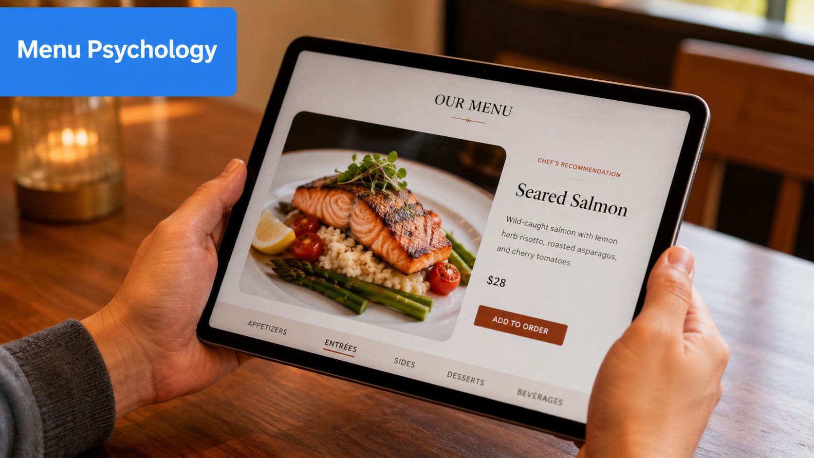
A digital menu isn't just a list of dishes. It's product merchandising on a small screen.
That changes how you should present food:
- Lead with appetite appeal: A strong dish photo can do more sales work than a long description.
- Write for scanning: Short descriptions beat dense text blocks. Focus on flavor, texture, and what makes the dish worth ordering.
- Reduce decision fatigue: Keep categories clean so guests don't bounce between similar items.
A common mistake is loading every item with the same visual weight. If every photo is large, every description is long, and every item looks equally important, nothing stands out. The guest doesn't feel guided.
Use structure to guide choices
Profitable menus help guests make a confident choice faster. That means arranging categories and item cards with intent.
For example, a café might structure the menu like this:
- Featured first: Seasonal latte, house pastry pairing, limited breakfast special
- Core sellers next: Espresso drinks, brewed coffee, sandwiches
- Add-on zone near checkout: Extra shot, milk upgrade, pastry, bottled drink
A full-service restaurant might handle it differently:
- Start mains with the items you most want to sell
- Add “popular” or “chef's recommendation” markers where they support confidence
- Keep modifiers visible, but don't bury the main value proposition under option overload
Good menu design doesn't push harder. It removes hesitation.
Another practical point. Mobile users don't read like diners holding a hardcover wine list. They flick, compare, and decide quickly. That means your profitable items need one of these advantages:
- Better placement
- Stronger photo
- Clearer naming
- More persuasive description
- Easier pairing path
A short comparison helps:
| Weak mobile menu | Better mobile menu |
|---|---|
| Generic dish names | Names that signal flavor and style |
| Long paragraphs | Short, readable descriptions |
| Flat category order | Intentional category prioritization |
| No visual cues | Badges for featured or popular items |
| Hidden add-ons | Easy modifier and pairing flow |
For operators, the discipline is simple. Every item should answer one question: why choose this instead of the next item on the screen?
If the answer isn't obvious, rewrite it, reframe it, or reposition it.
Drive Higher Checks with Smart Upselling
A QR menu should do more than display dishes. It should raise average order value with prompts that appear at the exact moment a guest is deciding.
That matters because verbal upselling is uneven by nature. One server recommends the premium side every time. Another skips it during a rush. A bartender may remember to suggest a spirit upgrade, while the lunch team never mentions add-ons at all. A well-set digital flow closes that gap and makes the offer consistent table after table.
Prompt the next best choice
The highest-performing upsells feel like good service.
If a guest selects a burger, show the better side before they move on. If they choose pasta, offer garlic bread or the house red while that dish is still top of mind. If they order coffee, place the pastry pairing one tap away. Timing does the work here. The suggestion appears during the decision, not after the cart is already mentally closed.
The rule is simple. Offer the next logical purchase, not every possible extra.
Use prompts that are:
- Directly tied to the item selected
- Easy to add in one tap
- Clear on price and value
- Small enough to feel low-risk
A few examples from real menus:
- A burger prompts truffle fries or onion rings
- A brunch plate suggests bacon, avocado, or fresh juice
- A pizza order offers burrata, chili oil, or a second dip
- A margarita triggers a top-shelf tequila upgrade
For operators who want more examples, this guide to restaurant upselling techniques that work in real service environments is useful.
Build offers around margin, not guesswork
Many restaurants set up upsells based on what sounds appealing. The better approach is to build them around margin, prep reality, and speed of service.
A smart add-on usually has three traits. It carries strong margin. It adds little kitchen friction. It fits the guest's existing intent. Garlic bread works because the kitchen can fire it fast, the guest already understands it, and the check rises without creating a complicated station issue. A premium protein add-on can work too, but only if the line can handle the modifier cleanly during peak periods.
That trade-off gets missed all the time.
I have seen operators push too many custom upgrades through a QR menu and slow the kitchen enough to erase the gain. A better setup limits prompts to offers the team can execute fast and consistently.
Promote what deserves attention
High-margin items often get buried in a long category. On mobile, buried usually means ignored.
Use the QR menu to feature what deserves visibility:
- Daily specials at the top during the shift
- Bundles that increase spend while making the choice easier
- Limited offers that create urgency without reprinting menus
- Signature add-ons attached to the dishes that sell them best
A neighborhood bistro might handle it like this:
| Menu situation | Better digital move |
|---|---|
| Slow-moving dessert section | Show one signature dessert after entrée selection |
| Inconsistent drink pairing | Attach one wine or cocktail suggestion to top mains |
| Busy lunch with rushed staff | Promote a lunch combo instead of relying on verbal add-ons |
| Frequent special changes | Update featured items before service starts |
One caution. Too many prompts hurt conversion.
Guests stop reading when every screen asks for another decision. One useful suggestion beats four weak ones. If a burger comes with one strong side upgrade and one drink pairing later in the flow, that can work. If the guest gets hit with sides, sauces, dessert, merch, loyalty, and catering on the same path, the menu starts working against itself.
Review the performance regularly. If a premium side gets views but few adds, the issue may be price, naming, or weak appetite appeal. If bundles convert better than single-item add-ons, put more effort into combo design. If a featured cocktail gets taps but not orders, the image may be doing the selling while the price stops the purchase.
RevMenue gives restaurants a mobile-friendly QR menu, supports interactive menu presentation, and helps operators connect upsells, bundles, and revenue reporting in one workflow.
A quick product walkthrough makes the concept easier to visualize:
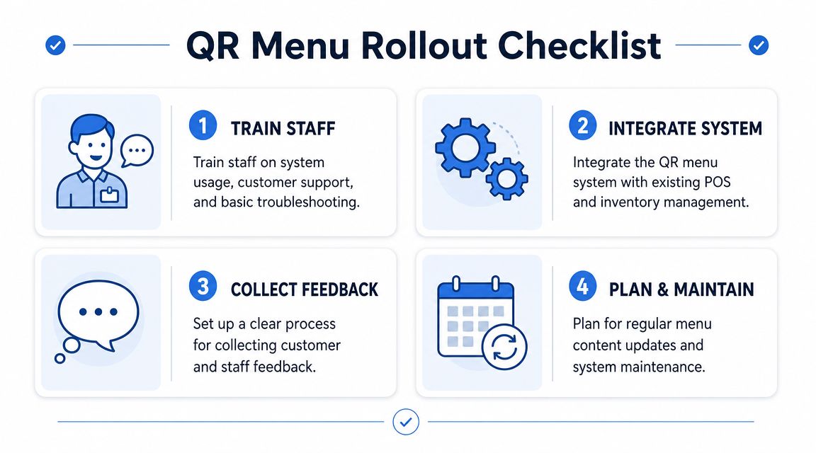
Streamline Operations and Support Your Team
A QR menu helps only if it fits the way service runs.
I see the same failure pattern in dining rooms that rush the rollout. The code works, the menu loads, and management assumes the job is done. Then servers spend the shift explaining where to scan, hunting down sold-out items that still appear on phones, and calming guests who wanted dinner, not a tech lesson. That is not efficiency. It is labor shifted from one task to another.
Train for fast, practical table-side use
Staff do not need a script they can barely remember during a rush. They need a short introduction, a backup option, and a clear rule for when to step in.
A workable table approach looks like this:
- Simple greeting: “You can scan the code to view the menu on your phone.”
- Clear backup: “If you'd prefer, I can bring a printed menu.”
- Basic support: “If the page doesn't load, I can help.”
That keeps the interaction short and reduces hesitation at the table. It also protects service speed, because the team is not inventing explanations on the fly.
Accessibility affects operations more than many operators expect. Guidance from GetSauce on QR code menus for restaurants highlights practical basics such as readable formatting, screen-reader support, and font scaling. In service terms, that means fewer stalled orders, fewer awkward handoffs, and less dependence on staff to interpret the menu for the guest.
Keep the standards simple:
- Keep printed menus available: Some guests still want a physical menu, and forcing the phone option creates friction.
- Use readable digital formatting: Larger text and strong contrast reduce squinting, repeat questions, and abandoned scans.
- Avoid phone-only assumptions: Staff should offer help early, not wait until the guest is already frustrated.
Improve dining room flow
Placement drives adoption.
Codes hidden behind sauce bottles or printed too small on a worn table tent create avoidable delays. Good placement gives guests a clear line of sight from their seat and gives waiting guests access before they order. In counter-service formats, this can shorten the decision window before the cashier has to step in.
A strong setup usually includes:
- Table placement: Visible from a seated position, not buried under condiments
- Entry placement: Useful for queues and waiting guests
- Counter placement: Important for cafés, bakeries, and quick-service formats
- Receipt placement: Helpful for reorders, feedback, and return visits
Add context next to the code. “Scan for menu” works better than a silent square on acrylic because it removes one extra moment of doubt.
Guests usually accept QR menus when the process is obvious. They push back when the setup is unclear.
Connect the menu to daily service
The menu should match what the kitchen can sell right now, what the POS can ring in correctly, and what the floor team can support without workarounds.
If the system is disconnected from operations, the problems show up fast:
- Guests order items that just sold out
- Staff manually explain unavailable modifiers
- Prices change in one place but not another
- Managers patch issues during service instead of before it
Regarding labor, operators either save it or create more of it. A synced setup lets a manager 86 an item once, adjust modifiers once, and trust the change to appear everywhere guests order. That matters most during busy periods, when every manual correction steals time from the floor.
If you are comparing systems, this overview of QR code menu software for restaurants is a useful starting point for assessing POS connection, live menu control, and ordering workflow.
Privacy also needs a clean process. If the menu collects guest data, make consent explicit, explain what is being collected, and make sure the workflow matches the rules that apply to the business. Managers do not need a legal seminar. They need a system the team can use correctly every shift.
Use Data to Make Smarter Decisions
A QR menu earns its keep when it shows where money is being won and lost.
Floor feedback helps, but it misses the quiet failures. Guests may tap a high-margin cocktail, read the description, and skip it because the photo is weak or the pairing prompt shows up too early. A printed menu rarely exposes that. A digital menu can.
As noted earlier, QR menu use varies by customer base. That is exactly why broad adoption trends matter less than your own scan, view, and conversion patterns.
Watch behavior, then act on it
Start with a short list of questions tied to revenue and service:
- Which items get opened often but ordered rarely
- Which categories get skipped
- Which add-ons are accepted
- Where guests stop before ordering
- Which items convert better by daypart or table type
This is the difference between guesswork and management. If a steak frites page gets heavy traffic but weak orders, the problem might be price resistance, a flat description, or a missing modifier that guests expect. If desserts only move when they appear near the end of the meal flow, the issue is timing, not demand.
I have seen operators misread this every week. The team says a dish is a favorite because guests ask about it. The menu data shows plenty of curiosity but weak conversion, while a less talked-about pasta quietly delivers better margin and stronger attach rates on wine.
Run small tests that change margin
Do not rebuild the whole menu at once. Change one variable, give it enough traffic to matter, then keep or cut it based on results.
| Test | What to watch |
|---|---|
| Rename a dish | Whether more guests open it or order it |
| Swap the photo | Whether conversion improves |
| Move a category higher | Whether views turn into orders |
| Change an upsell pairing | Whether add-on acceptance rises |
The best tests are operationally simple. Move one profitable appetizer higher. Add a clearer ingredient callout to a premium entrée. Replace a generic "add fries" prompt with a pairing that fits the dish and carries better margin. Then review what happened.
A useful reporting setup should answer practical questions fast. Which lunch item gets attention but stalls at checkout? Which cocktail pairing works on Friday night but not Tuesday lunch? Which modifier creates friction because too many guests open it and abandon the order? A good framework for tracking that behavior is outlined in this guide to restaurant data analytics for menu decisions.
Discipline matters more than volume. One useful test per week beats a full menu redesign based on instinct.
A QR code menu should produce better decisions, stronger check averages, and fewer service corrections. If you want a system built around those outcomes, RevMenue is a practical option for turning menu scans into clearer decisions, stronger upsells, and easier day-to-day management.